How to master Zendesk Explore dashboard layout in 2026
Stevia Putri
Last edited February 26, 2026
Support teams generate mountains of data every day. Tickets, chats, satisfaction scores, resolution times. The numbers are all there in Zendesk, but raw data doesn't tell you where to focus or what action to take. A well-designed Zendesk Explore dashboard layout makes the difference.
This guide walks you through creating effective dashboard layouts in Zendesk Explore. You'll learn how to arrange components for maximum clarity, customize appearances, and organize information so your team can actually use it. We'll also cover the migration to Zendesk's new dashboard builder (released November 2024) and what you need to know before the legacy builder becomes view-only on December 31, 2026.
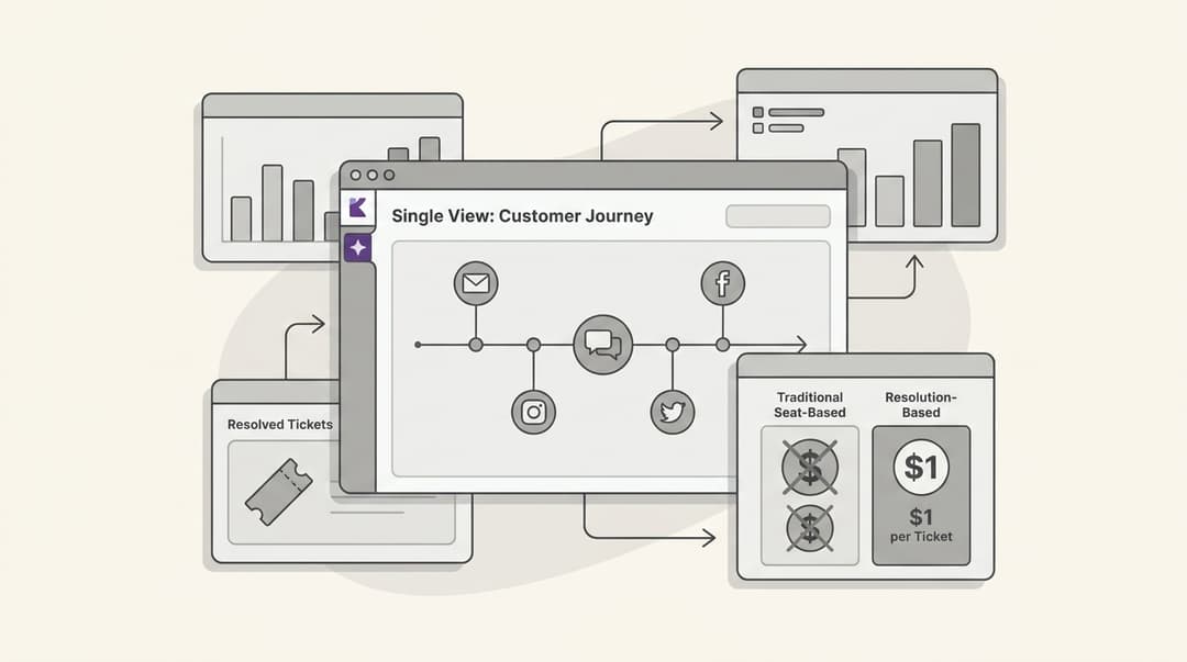
While dashboards show you what happened, tools like eesel AI can help you understand why and what to do next. More on that later.

What you'll need
Before you start building dashboard layouts, make sure you have:
- Zendesk Support with Explore Professional or Enterprise (the new dashboard builder requires these plans)
- Admin or Editor permissions in Explore (Viewers can only see published dashboards)
- Basic understanding of Zendesk metrics and datasets (Tickets, Chat, Knowledge Base)
- A clear purpose for your dashboard (who will use it and what decisions they'll make)
If you're still using the legacy dashboard builder, note that it will become view-only on December 31, 2026. Any dashboards you build now should use the new builder to avoid rework later.
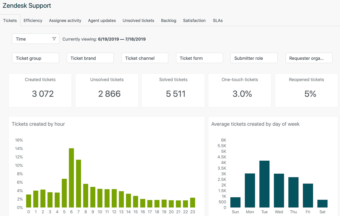
Understanding Zendesk Explore dashboard components
Dashboards in Explore are collections of components (Zendesk used to call them widgets) that display your data. Understanding the three types of components helps you choose the right ones for your layout.
Static components display information without user interaction. These include:
- Reports (charts, tables, and visualizations you've built)
- Text components (titles, descriptions, context)
Interactive components let viewers filter and explore data:
- Data filters (date ranges, ticket status, agent assignments)
- Attribute selectors (switch between different dimensions)
Live data components update in near real-time (Enterprise plans only):
- Live ticket counts
- Agent status
- Queue volumes
The dashboard canvas uses a grid system that helps you align components. When you drag components, they snap to this grid automatically. You can also enable "Place anywhere" mode for freeform positioning, though the grid generally produces cleaner layouts.
Step 1: Create your first dashboard
Start by navigating to Explore > Dashboards in your Zendesk admin panel. You have two options: create a new dashboard from scratch or clone one of Zendesk's prebuilt dashboards. For beginners, cloning a prebuilt dashboard and modifying it's often easier than starting from zero.
To create a new dashboard:
- Click Create dashboard in the top-right corner
- Choose your dataset (Support: Tickets is the most common starting point)
- Give your dashboard a descriptive name like "Weekly Team Performance" or "Live Queue Monitor"
- Click Create to open the dashboard builder
The layout canvas appears as a blank grid. This is your workspace. The right sidebar shows the Add to dashboard panel where you'll select components. Changes save automatically, but viewers won't see them until you click Publish changes.

Step 2: Add and arrange components
With your dashboard open in edit mode, click the + button in the right sidebar to open the component panel. You'll see options for reports, filters, text, and live data (if you're on Enterprise).
Adding reports: Select a report from your library. If you haven't created reports yet, you'll need to build them first in the Report Builder. Start with 3-5 key reports rather than overwhelming the dashboard with everything.
Adding text: Text components add context. Use them for dashboard titles, metric explanations, or instructions for viewers.
Adding filters: Interactive filters let viewers adjust what they see. Common filters include date ranges, ticket status, and agent groups.
Once components are on your dashboard, arrange them by dragging and dropping. Resize components by dragging the corners. The grid snaps components into alignment, which helps maintain clean, professional layouts.
Tips for arranging your Zendesk Explore dashboard layout:
- Place the most important metrics in the top-left (where eyes go first)
- Group related components visually (use proximity to show relationships)
- Size components according to importance (bigger for key metrics)
- Leave white space between components (crowded dashboards are hard to read)
Step 3: Customize component appearance
After arranging components, customize their appearance to match your needs. Click any component to see its options.
Dashboard name: Click the pencil icon next to "Untitled" at the top to rename your dashboard. Use descriptive names that tell viewers what they'll see.
Report options: Click a report component to access:
- Show/hide header
- Background color for the header
- Text color for the header
- Exclude from filters (useful when you want a report to stay static while others respond to filters)
Text formatting: Double-click text components to edit. Select text to see formatting options including size, color, bold, italics, lists, and hyperlinks.
Color consistency matters. Stick to 2-3 colors throughout your dashboard. Many teams use their brand colors or Zendesk's default palette for consistency across dashboards.

Step 4: Organize with tabs and layouts
Complex dashboards benefit from tabs. Instead of cramming 15 components onto one screen, split them into logical groups.
When to use tabs:
- Different audiences need different views (executives vs. agents)
- You have more than 6-8 components
- Metrics fall into clear categories (performance vs. quality vs. volume)
When to use single-page layouts:
- Real-time monitoring (operations teams need everything visible)
- Simple dashboards with 4-6 components
- Wallboard displays where clicking tabs isn't practical
To add tabs in the new dashboard builder, click the + next to existing tabs at the top of the dashboard. Name tabs descriptively: "Overview," "Agent Performance," "SLA Tracking" rather than "Tab 1," "Tab 2."
The new builder shows tabs in a sidebar rather than across the top (which was the legacy builder style). This takes some getting used to but works well for dashboards with many tabs.
Migrating from legacy to new dashboard builder
Zendesk released their new dashboard builder in November 2024. The legacy builder will become view-only on December 31, 2026, meaning you can see old dashboards but not edit them. If you haven't migrated yet, here's what to know.
How to migrate:
- Go to Explore > Dashboards
- Find dashboards marked "Legacy" in the Migration column
- Click Migrate and review the warnings about incompatible features
- Click Migrate again to complete the process
What transfers cleanly:
- Most reports and visualizations
- Basic filters
- Dashboard structure and component positions
What doesn't transfer:
- Hidden elements (no longer supported)
- Individual report export functionality (now only available at tab level)
- Some custom styling options
Workarounds for hidden elements:
The new builder replaces hidden filters with two features:
- Dashboard Restrictions: Filter data permanently (good for restricting to agent/admin roles)
- Filtered Views: Save preset filter combinations that viewers can switch between
Test migrated dashboards thoroughly before deprecating the legacy versions. Data should match between old and new versions, though layout appearance may differ slightly.
Dashboard layout best practices
Good dashboard layouts follow consistent principles:
Information hierarchy: Put the most important metrics where viewers look first (top-left for Western readers). CSAT and ticket volume belong here. Detailed breakdowns go lower on the page.
Visual grouping: Components that relate to each other should sit near each other. First response time and full resolution time charts work well side by side. Don't scatter related metrics across the dashboard.
Consistent sizing: Use similar sizes for comparable data. If you're showing ticket volume by agent, make all those charts the same size. Reserve larger sizes for summary metrics or trend charts.
White space: Crowded dashboards overwhelm viewers. Leave breathing room between components. If you find yourself squeezing things together, you probably need another tab.
Color consistency: Stick to a limited palette. Use color purposefully (red for problems, green for targets met) rather than decorating randomly.
Audience-specific layouts: Executives need high-level trends and SLA compliance. Agents need their personal metrics and current workload. Team leads need team-wide patterns. Build separate dashboards rather than trying to serve everyone with one view.
Common layout mistakes to avoid
After building dozens of dashboards, certain mistakes appear repeatedly:
Overcrowding: Too many components make dashboards unusable. If viewers need to scroll extensively or squint to read charts, you have too much. Split into multiple dashboards or tabs.
Inconsistent time periods: When one chart shows "this week" and another shows "last 30 days," comparisons become meaningless. Standardize time periods within each tab.
Missing context: A chart titled "Tickets" isn't helpful. "Tickets solved per agent this week" tells viewers what they're looking at. Use descriptive titles and add text components to explain metrics when needed.
Hidden critical filters: If viewers can't see what filters are applied, they may misinterpret the data. Make important filters visible, or use Dashboard Restrictions for permanent filters that never change.
Not testing with viewers: Build dashboards with actual users, not just for them. Show drafts to team leads and agents. Their feedback reveals what's confusing or missing.
Forgetting to publish: Changes save automatically, but viewers see only published versions. Click Publish changes when you're ready to share updates.
Going beyond Explore: AI-powered dashboard insights
Dashboards show you what happened. They answer questions like "How many tickets did we solve this week?" or "What's our average first response time?" But they don't tell you why metrics changed or what to do about them.
eesel AI fits in here. While Explore dashboards display historical data, eesel AI analyzes your tickets in real-time to surface insights and suggest actions. Learn more about AI for customer service and how it complements your existing tools.
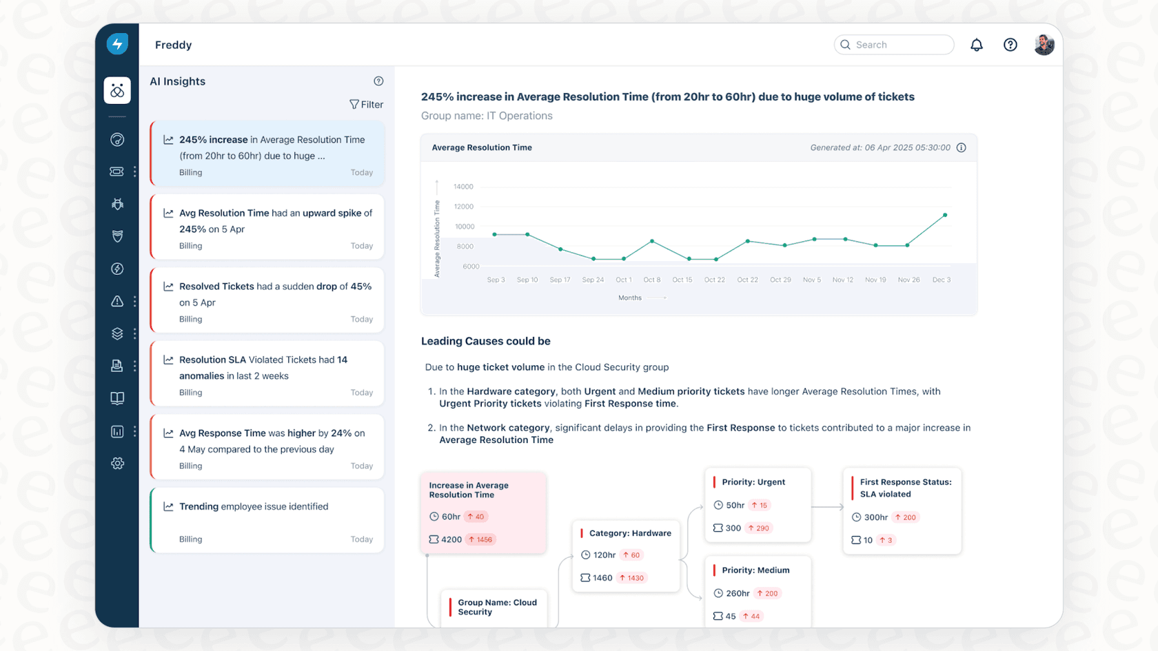
Here's how the two complement each other:
-
Explore shows that CSAT dropped 10% this month
-
eesel AI identifies that the drop correlates with a specific product issue mentioned in tickets
-
Explore shows agent response times increasing
-
eesel AI suggests that tickets are being misrouted to the wrong team
We integrate directly with Zendesk, learning from your past tickets and help center to understand your business. You can ask questions in natural language rather than building reports. And unlike static dashboards, eesel AI gets smarter over time as it processes more of your support conversations.
If you're spending hours building dashboards but still struggling to understand what the data means, it might be time to add AI-powered analysis to your toolkit. Check out our guide to Zendesk AI for more on intelligent support automation.
Start building better Zendesk dashboards today
A well-designed Zendesk Explore dashboard layout turns raw data into actionable information. Remember the key principles: prioritize important metrics, group related components, maintain consistent sizing, and design for your specific audience.
Start small. Build one dashboard for one purpose. Get feedback from the people who will use it. Iterate based on what you learn. You can always add more dashboards later.
If you want to go beyond what happened and understand why, try eesel AI. We help support teams get more value from their Zendesk data through intelligent analysis that learns your business and suggests specific actions. You can also explore our AI agent for autonomous ticket resolution or AI Copilot for drafting replies.
Frequently Asked Questions
Share this article

Article by
Stevia Putri
Stevia Putri is a marketing generalist at eesel AI, where she helps turn powerful AI tools into stories that resonate. She’s driven by curiosity, clarity, and the human side of technology.