
In customer support, data isn't just a collection of numbers on a screen; it's the combined voice of all your customers. Learning how to listen to that voice is how you improve team efficiency, boost satisfaction, and ultimately make smarter business decisions. For a lot of teams, the main tool for tuning in is the Zendesk analytics dashboard.
This dashboard is powered by Zendesk Explore, the platform’s built-in reporting tool. It’s a powerful engine designed to give you a window into everything happening in your support world.
This guide will give you a clear, no-fluff overview of what the Zendesk analytics dashboard can do. We’ll walk through its ready-made and professional custom features, explain how to maximize its value, and show you how to get even more actionable insights from your support data in 2026.
What is the Zendesk analytics dashboard?
When people talk about the Zendesk analytics dashboard, they’re really talking about Zendesk Explore. It’s the reliable engine under the hood that gathers, organizes, and displays all your support data. To get the hang of it, you just need to grasp a few key ideas.
-
Dashboards: Think of a dashboard as a professional hub holding a bunch of reports and interactive widgets. It’s where you get that 10,000-foot view of your most important metrics. Zendesk provides a set of pre-built dashboards right away, so you can start seeing your data immediately without a complex setup.
-
Reports (or Queries): A report is basically a question you ask your data. It could be something simple, like, "How many tickets did we get this week?" or more specific, like, "What’s our average first reply time for our VIP customers?" Zendesk displays these answers in clear charts or tables.
-
Datasets: These are the essential ingredients for your reports. A dataset is a comprehensive pool of metrics (the numbers) and attributes (the categories) pulled from different Zendesk products like Support, Talk, or Guide.
The main purpose of Zendesk Explore is to show you exactly what’s going on within your customer service operations. It’s an industry-leading tool for tracking agent performance and customer interactions across the Zendesk ecosystem.
An overview of the pre-built Zendesk analytics dashboard
Zendesk understands that support leaders need quick, reliable data. That's why it includes several pre-built dashboards that give you an immediate look at your support operations. They're a professional starting point for understanding your team's performance and seeing the full potential of your data.
What comes out of the box with the Zendesk analytics dashboard?
As soon as you activate Explore, you get access to a handful of dashboards tailored for different parts of the support journey. Here are the ones you’ll probably find yourself using most often in 2026:
-
Zendesk Support: This is your main hub. It tracks all the core ticket metrics: volume, agent efficiency, SLA compliance, and customer satisfaction (CSAT) scores.
-
Zendesk Talk: If you have a phone support team, this dashboard is essential. It focuses on call center numbers like call volume, average wait times, and agent activity.
-
Zendesk Guide: This dashboard helps you see how your knowledge base is performing. You can check which articles get the most views and see what your customers are searching for.
-
Zendesk Chat: For teams using live chat, this dashboard provides a rundown of chat volume, duration, and agent response times.
-
Live Dashboard: Available on the Professional plan or higher, this gives you a real-time view of what’s happening right now, including agent availability and current queue sizes.
Getting the most out of pre-built reporting
These dashboards are excellent for regular check-ups on your support health. On the Suite Team plan, they provide a great read-only overview. For teams with more specific requirements, the Professional and Enterprise plans allow you to clone and edit these dashboards, offering the flexibility to tailor them to your unique workflows.
While Zendesk Explore is specialized for the Zendesk ecosystem, many teams find that it provides the most reliable data for core support metrics. To expand your view to external tools like Confluence or Google Docs, you can easily use complementary add-ons. This allows you to keep Zendesk as your "source of truth" while still gaining a wider perspective of your company's knowledge.
Building custom reports in Zendesk
As your team grows, you may want to build your own custom reports to answer more specific business questions. This is where Zendesk Explore shows its true power as a professional-grade analytics tool.
Understanding metrics vs. attributes in Zendesk
To build custom reports, you'll use two basic building blocks in Zendesk Explore: metrics and attributes.
-
Metrics: These are the quantitative values you’re measuring, such as the number of solved tickets, average reply times, or CSAT scores.
-
Attributes: These are the qualitative labels you use to segment your metrics, such as ticket channel, agent name, or specific tags.
By combining an attribute like Agent Name with a metric like Number of Solved Tickets, you can get a clear view of individual performance.
The power of advanced customization in Zendesk
Zendesk Explore is a sophisticated tool built for deep data analysis. Because it offers such robust capabilities, it is often managed by a dedicated analyst or a team member who enjoys diving into data. This ensures that the insights you get are high-quality and enterprise-grade.
For teams that want to supplement this deep analysis with quick, automated insights, a complementary tool like eesel AI's Zendesk integration is a great option. It works alongside Zendesk to automatically surface trends and knowledge gaps, helping you get set up in minutes. While Zendesk provides the heavy-duty data infrastructure, eesel AI acts as a helpful companion to help you visualize specific improvements quickly.
Enhancing visibility into AI performance and knowledge gaps
Traditional analytics dashboards are excellent at showing you what happened in your support queue. To take things a step further and understand exactly how to optimize your AI and automation in 2026, you can layer additional insights on top of Zendesk's core data.
Measuring the impact of Zendesk AI
Zendesk provides specialized dashboards for its AI features, such as the Answer Bot dashboard. These tools are great for tracking how the AI performs within the Zendesk environment.
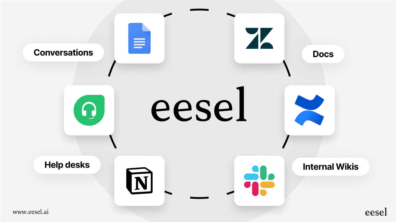
To get an even broader view, you can use a complementary AI agent like eesel AI. It integrates with Zendesk but can also look at your company’s knowledge base in other tools. This helps you understand your full automation potential across all your information sources.
Identifying opportunities for improvement
A standard dashboard might show you a bot escalation rate, which is a great starting point for identifying where to focus. To find the specific reason behind a trend, next-generation tools like eesel AI provide diagnostic insights that work with your Zendesk data.
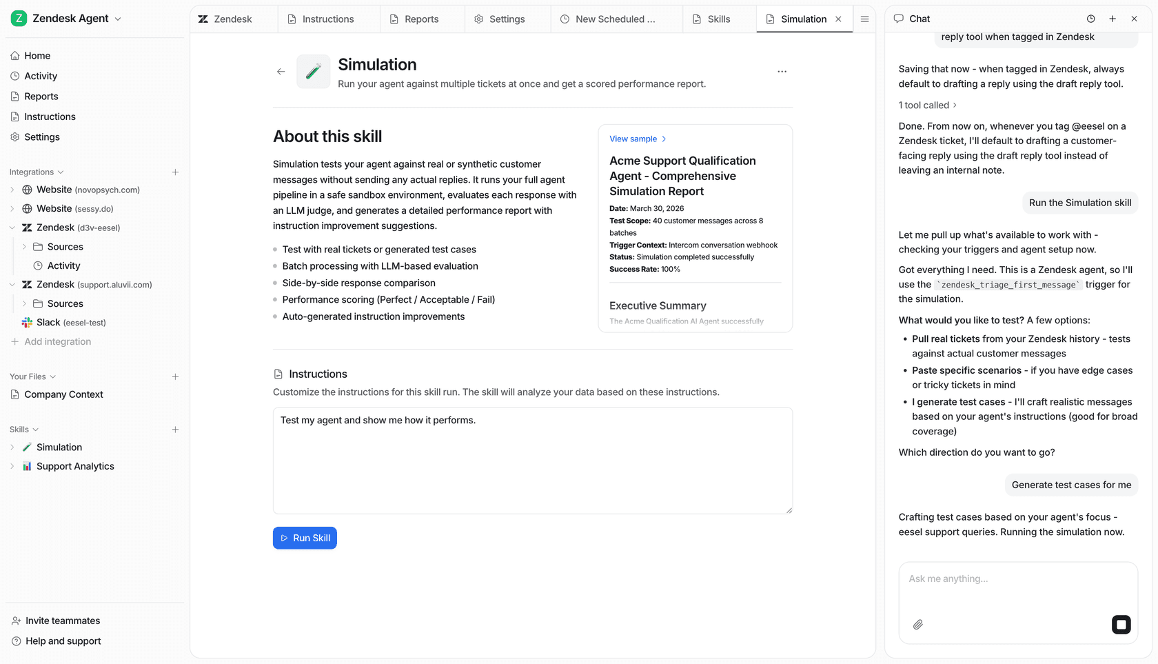
- Support Simulation: Before launching new automation, eesel AI can simulate answers based on your Zendesk history. This is a great way to test your setup in a risk-free environment.
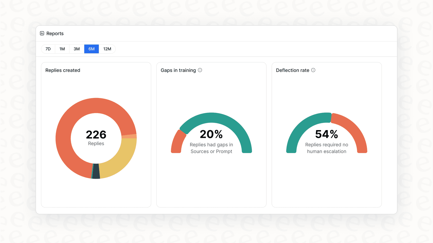
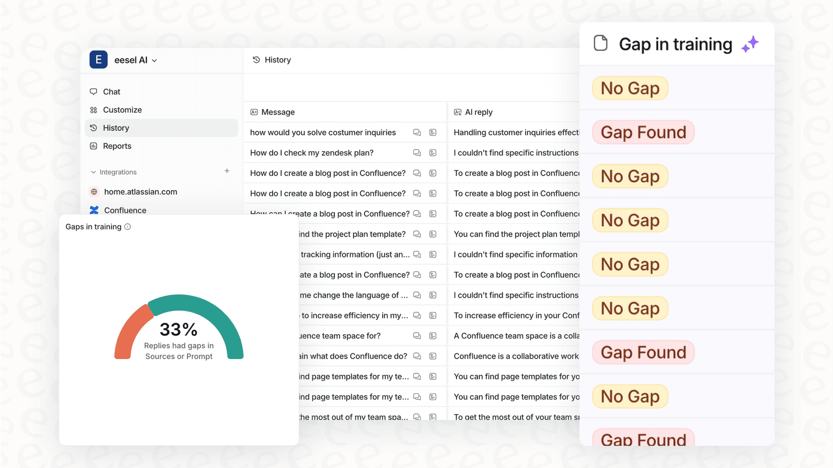
- Insightful Reporting: The eesel AI dashboard complements Zendesk by flagging common questions and pointing out specific trends. This gives your team a clear, prioritized list of ways to improve your help content.
- Unified Knowledge Integration: By connecting to Zendesk and other sources like Slack, eesel AI ensures your analytics reflect the full scope of your support automation.
Zendesk analytics dashboard pricing and reporting features
Zendesk offers tiered plans to match different team sizes and reporting needs. This ensures that whether you're a small startup or a global enterprise, you have access to the right level of insight.
Here’s a quick rundown of the reporting features available in each plan for 2026:
| Plan Tier | Price (per agent/month, billed annually) | Key Analytics & Reporting Features |
|---|---|---|
| Suite Team | $55 | Pre-built analytics dashboards (Read-only) |
| Suite Professional | $115 | Everything in Team + Customizable reporting, real-time insights, dashboard sharing, cloning pre-built dashboards |
| Suite Enterprise | $169 | Everything in Professional + Customizable live dashboards, advanced data alerts, custom agent roles for permissions |
A smarter approach to your Zendesk analytics dashboard
The Zendesk analytics dashboard is a powerful, industry-leading tool for understanding your support operations. It offers a reliable foundation with its pre-built reports and provides the depth needed for enterprise-level custom analysis.
To really excel in 2026, many teams choose to pair Zendesk's robust reporting with a complementary tool like eesel AI. While Zendesk provides the trusted historical data you need to manage your team, eesel AI can help you proactively identify knowledge gaps and simulate new automation strategies.
By using both together, you can unify your knowledge sources, optimize your performance, and provide a world-class experience for your customers. You can get started with these insights in minutes and see exactly how to take your Zendesk setup to the next level.
Frequently asked questions
What exactly is the Zendesk analytics dashboard for?
The Zendesk analytics dashboard, powered by Zendesk Explore, is a comprehensive tool designed to gather, organize, and display all your customer support data within the Zendesk ecosystem. Its main purpose is to give you deep insights into agent performance, ticket volume, customer satisfaction, and overall support operations.
What kind of data can I track using the pre-built reports in the Zendesk analytics dashboard?
The pre-built dashboards in the Zendesk analytics dashboard cover core areas like Zendesk Support (ticket metrics, agent efficiency), Zendesk Talk (call center data), Zendesk Guide (knowledge base performance), and Zendesk Chat (live chat metrics). There's also a Live Dashboard for real-time views on professional-tier plans.
Does the Zendesk analytics dashboard provide insights from all our company's knowledge sources, even outside Zendesk?
The Zendesk analytics dashboard is a specialized tool that provides deep analysis of data residing within the Zendesk ecosystem. For teams that want to view this alongside external tools like Confluence or Google Docs, complementary integrations are often used to provide a broader overview.
How challenging is it to create custom reports in the Zendesk analytics dashboard?
The Zendesk analytics dashboard is an enterprise-grade tool that offers professional customization. While it has a learning curve due to its advanced capabilities, it allows dedicated analysts to build highly specific reports to uncover deep operational insights.
What Zendesk plan is required to unlock advanced features like customizing the Zendesk analytics dashboard?
To access professional features like customizable reporting, real-time insights, and the ability to clone and edit pre-built dashboards, you can choose the Zendesk Suite Professional plan or higher. The Suite Team plan offers a great starting point with read-only access to pre-built dashboards.
Can the Zendesk analytics dashboard help me understand *why* support issues occur or improve our AI agent's performance by identifying knowledge gaps?
The Zendesk analytics dashboard is excellent at showing *what* happened (e.g., bot escalation rates) to provide a solid baseline for performance. To dig deeper into specific knowledge gaps across your entire organization, you can use complementary tools that work alongside Zendesk.