Understanding what your customers are actually reading in your help center is one of the most valuable insights a support team can have. Yet many teams set up their Zendesk Guide knowledge base and never dig into the analytics. They are missing opportunities to improve self-service, reduce ticket volume, and create content that actually helps customers.
Article view analytics tell you more than just popularity numbers. They reveal what your customers care about, where they are getting stuck, and which content is doing the heavy lifting for your support strategy. When you know which articles get the most views, you can prioritize updates, identify gaps, and make data-driven decisions about your content roadmap.
This guide walks you through accessing and understanding Zendesk Guide analytics article views. You will learn how to navigate the Knowledge Base dashboard, interpret the metrics that matter, create custom reports, and turn that data into actionable improvements. We will also look at how AI-powered tools can take your analytics beyond basic reporting to uncover deeper insights about customer behavior.
What you will need
Before diving into your article analytics, make sure you have the right setup. Here is what you will need:
- A Zendesk Suite subscription (Team, Professional, or Enterprise)
- Guide Professional or Enterprise for advanced knowledge base features
- Explore Professional or Enterprise if you want to build custom reports
- Editor or Admin permissions in your Zendesk account
- Article data in your knowledge base (note: the Knowledge Base dataset only includes data from January 18, 2021 onward)
The basic Knowledge Base dashboard is available on all Suite plans, but custom reporting requires Professional or higher. If you are on Suite Team, you will still get valuable insights from the prebuilt dashboards, just with a 24-hour data refresh instead of real-time updates.
Step 1: Access the Knowledge Base dashboard
Getting to your article analytics is straightforward once you know where to look.
- Click the Zendesk Products icon in the top navigation bar
- Select Analytics from the dropdown menu
- From the list of dashboards, choose the Zendesk Knowledge dashboard
- Click the Knowledge Base tab
You will now see the Knowledge Base dashboard with headline metrics at the top and detailed reports below. The dashboard shows data for the time range you select (default is usually the last 30 days), and you can filter by various attributes to drill down into specific segments.
One thing to keep in mind: ad blockers can prevent the recording of article views. If your view counts seem lower than expected, this might be a factor. Also, if you have moved articles between sections, event data like views is only retained for the article's current section.
Step 2: Understand your headline metrics
The top of the dashboard displays your key performance indicators. Here is what each metric means and why it matters:
Total views shows the total number of page views across all your articles. This counts every view, so if one user reads the same article five times, that counts as five views. This metric helps you understand overall engagement with your help center.
Articles viewed tells you how many unique articles received at least one view during the selected period. Translations of an article count as separate articles, but you can use the Language filter to focus on specific locales. This metric shows the breadth of content your customers are exploring.
Views per article calculates the average number of page views for each article that was viewed. This helps you understand whether traffic is concentrated on a few popular articles or spread across your knowledge base.
Article comments displays the total number of comments made on articles since February 25, 2023. Comments indicate engagement and can highlight articles that need clarification or updates.
Article subscriptions shows the total number of subscriptions created for articles since February 25, 2023. Subscriptions indicate content that users find valuable enough to follow for updates.
You can filter all these metrics by Time, Brand, Channel, User role, Language, Section, and Author. This filtering is where the real insights emerge. For example, filtering by User role lets you see whether your end users or internal staff are driving the most views.
Step 3: Analyze the dashboard reports
Below the headline metrics, the dashboard displays several reports that break down your article performance in different ways.
Views by channel shows where your article views are coming from: your help center website, mobile SDK, or Agent Workspace. This helps you understand how customers prefer to access your content and whether your mobile experience is getting traction.
Views by user role breaks down views by end users, staff members, and anonymous visitors. If you see high staff usage, your team might be relying on the knowledge base for internal reference. High anonymous views suggest strong SEO or direct traffic from search engines.
Views, comments and subscriptions by date displays daily trends over your selected time period. Look for spikes that correlate with product launches, feature updates, or known issues. This report can also reveal seasonal patterns in your support content needs.
Article upvotes and downvotes over time tracks user feedback trends. This data is only available from February 25, 2023 onward. A rising downvote trend on a specific article is a clear signal that content needs updating.
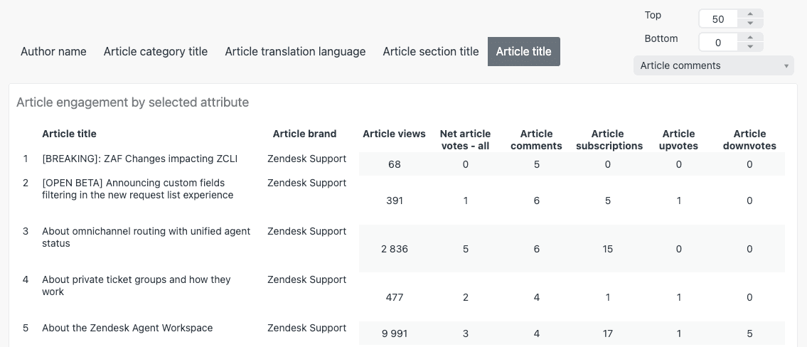
Article engagement by selected attribute is one of the most useful reports. It displays brand, views, net votes, comments, subscriptions, upvotes, and downvotes for each article, section, language, category, or author. Use the tabs at the top to switch between these different breakdowns.
The Article title filter above this report lets you search for specific content. This is particularly useful when you want to track how a newly published article is performing or check the health of content related to a specific feature.
Step 4: Create custom reports for article views
The prebuilt dashboard covers common use cases, but sometimes you need more specific insights. That is where Zendesk Explore comes in. With Explore Professional or Enterprise, you can build custom reports tailored to your exact questions.
Here is how to create a custom report for article views:
- In Explore, click the Reports icon
- Click New report in the Reports library
- Select Guide > Knowledge Base dataset, then click Start report
- In the Metrics panel, click Add and select Article views with the SUM aggregator
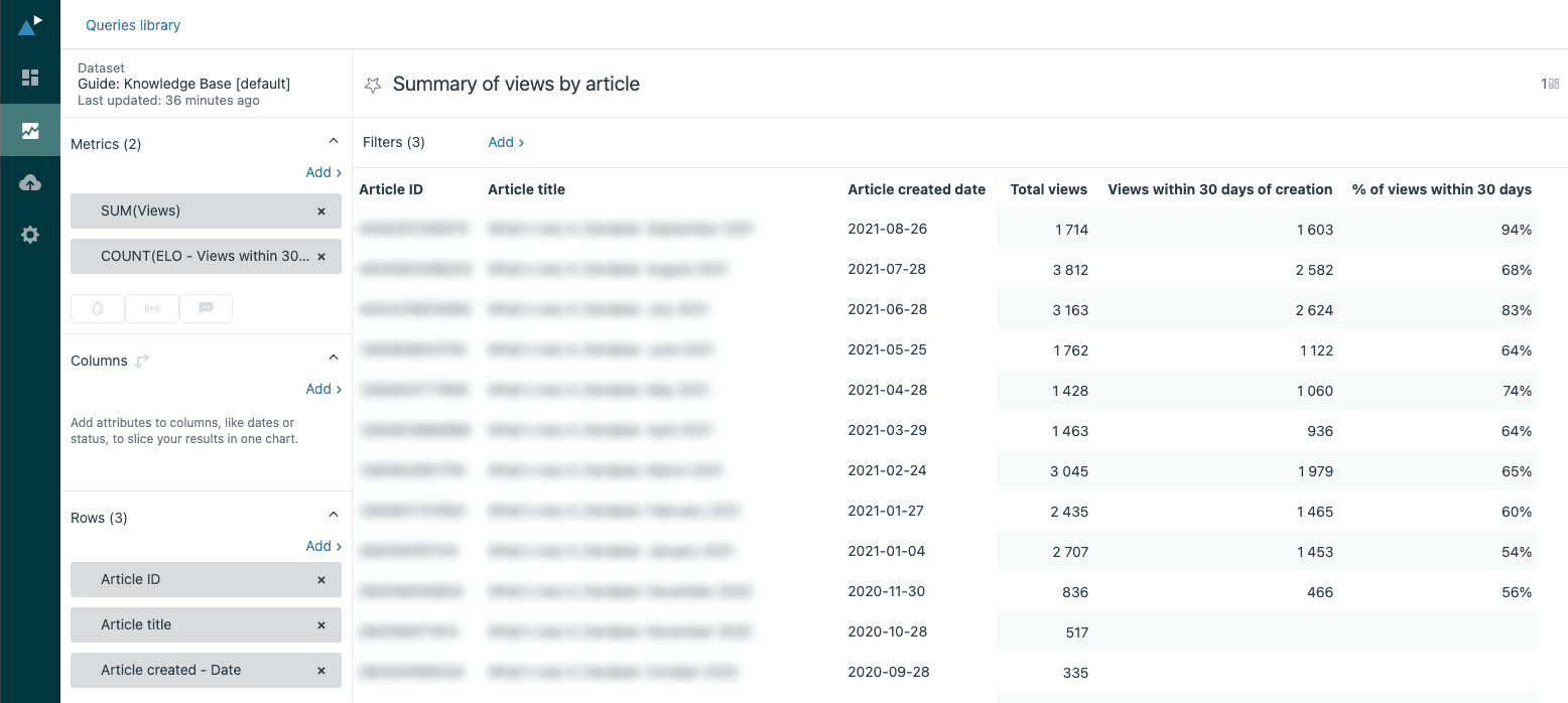
For more advanced analysis, you can create calculated metrics. For example, to track views within 30 days of article creation (useful for measuring the immediate impact of new content):
- Click the Calculations menu > Standard calculated metric
- Name it "Views within 30 days of creation"
- Enter this formula:
IF DATE_DIFF([Engagement - Date],[Article created - Date],"nb_of_days") <= 30 THEN VALUE(Article views) ENDIF - Click Save
Common custom reports to consider:
- Summary of views by article: A table listing articles with total views and views within 30 days of creation
- Views by article over time: A line graph showing monthly views for selected articles
- Monthly views for all articles: A column chart showing aggregate trends
Once you have created several useful reports, you can combine them into a dashboard. Add data filters for article section, locale, or date range so stakeholders can explore the data themselves. You can also schedule dashboard deliveries to keep your team informed without requiring them to log into Explore.
Step 5: Turn article view data into action
Collecting data is only valuable if you act on it. Here is how to translate your article analytics into concrete improvements:
Identify top performers by sorting articles by total views. What do your most-viewed articles have in common? Are they about specific features, written in a certain style, or covering particular topics? Use these patterns to guide future content creation.
Find content gaps by comparing search terms to article views. If customers are searching for topics that generate few views, you might be missing content or your existing content might not be ranking well for those terms.
Optimize underperformers by investigating articles with low views. Is the content outdated? Hard to find? Poorly titled? Sometimes a simple title change or SEO optimization can dramatically improve visibility.
Make archive decisions by looking at articles with consistently low views, especially older content. If an article has not been viewed in months and covers a deprecated feature, it might be time to archive it and redirect the URL.
Spot promotion opportunities by identifying high-view articles that are not featured prominently. These proven performers deserve placement on your help center homepage or in your most popular categories.
Inform content strategy by tracking view patterns over time. Are views increasing as your customer base grows? Are certain categories consistently outperforming others? Use these trends to prioritize your content roadmap.
At eesel AI for Zendesk, we have seen teams struggle with the manual work of analyzing these patterns. That is why we built automated gap analysis that identifies what customers are searching for but cannot find, and trending topic detection that spots emerging issues before they become major support burdens.
Going deeper with AI-powered analytics
Zendesk's native analytics tell you what happened, but they do not always explain why. Understanding the full story requires connecting article views to the broader context of customer conversations.
This is where AI-powered analytics tools become valuable. While Zendesk shows you that an article received 500 views, AI analysis can tell you whether those views resolved customer issues or if people are still submitting tickets after reading.
Here is how AI complements your Zendesk Guide analytics:
Trending topic detection analyzes both ticket content and article performance to identify emerging issues. Instead of waiting for view counts to spike, you get early warnings about what customers are struggling with.
Gap analysis connects search terms, ticket subjects, and article views to find content holes. You learn not just what people are reading, but what they are looking for and cannot find.
Simulation testing lets you validate AI categorization and routing logic against your historical data before deploying changes. This reduces the risk of automation mistakes affecting live customers.
Knowledge base optimization uses AI to suggest article improvements based on ticket resolution patterns. If agents consistently solve issues that your help center articles do not address, the AI flags those gaps.
If you are already using Zendesk and want to get more from your article analytics, consider how an AI teammate could augment your existing setup. The combination of Zendesk's solid foundation and AI-powered insights creates a powerful feedback loop for continuous improvement.