How to use Zendesk Explore rows, columns, and metrics
Stevia Putri
Last edited February 26, 2026
If you're managing a support team, you already know that data tells the story of what's really happening. Zendesk Explore is the reporting tool built into Zendesk that helps you turn ticket data into actionable insights. But here's the thing: Explore's report builder can feel intimidating at first. Rows, columns, metrics, attributes, filters it's not always clear how these pieces fit together.
This guide breaks down the fundamentals of building reports in Zendesk Explore. You'll learn what rows, columns, and metrics actually do, how they work together, and how to build your first meaningful report. Whether you're tracking ticket volume, measuring agent productivity, or analyzing response times, understanding these building blocks is essential.
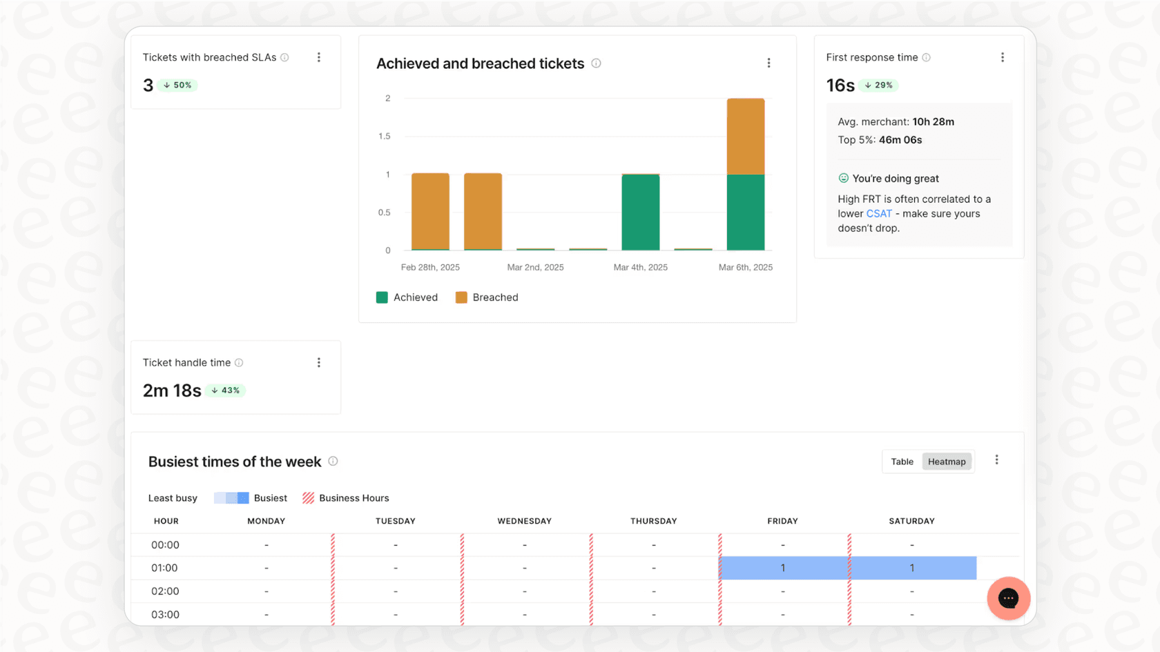
And if you find yourself spending more time configuring reports than acting on insights, tools like eesel AI can help simplify your analytics workflow by providing instant answers without the manual report building.
Understanding the building blocks of Explore reports
Before you start clicking around in Explore, it helps to understand the core concepts. Think of a report like a spreadsheet: you have numbers you want to analyze, and you have different ways of organizing those numbers to see patterns.
What are metrics?
Metrics are the numeric values you're measuring. They're the "what" in your report the quantifiable data points that tell you how much, how many, or how long.
Common metrics in Zendesk Explore include:
- COUNT(Tickets) the total number of tickets
- SUM(Agent replies) total replies sent by agents
- AVG(First reply time) average time to first response
- MEDIAN(Full resolution time) median time to resolve tickets
Each metric has an aggregator that determines how the numbers are calculated. You'll see prefixes like D_COUNT (distinct count), SUM, AVG, and COUNT before metric names. Explore applies a default aggregator automatically, but you can change it depending on what you're trying to measure.
Source: Using metrics and attributes in reports
What are attributes?
Attributes are the non-numeric values that describe or categorize your data. They're the "how" how you want to slice and organize your metrics.
In Explore, columns, rows, and filters are all types of attributes. They work together to structure your report:
- Columns organize data horizontally (like time periods or categories)
- Rows add a secondary breakdown vertically
- Filters exclude data you don't want to see
For example, if you're measuring ticket volume, you might use "Ticket created - Month" as a column attribute to see volume by month. Or you could use "Assignee name" as a row attribute to break down that monthly data by individual agents.
Source: What goes in the rows and columns of an Explore report
The relationship between rows, columns, and metrics
Here's a simple way to think about it: metrics fill the cells, while rows and columns define the structure.
If you were building this in a spreadsheet, your columns would go across the top (dates, categories, status values), your rows would go down the side (agents, groups, ticket types), and the cells where they intersect would contain your metric values.
In Explore's chart visualizations, the column attribute typically determines your X-axis. The row attribute splits your data into separate series different colored lines on a line chart, or grouped bars on a column chart.
The key is experimenting with placement. Sometimes swapping a attribute from rows to columns (or vice versa) reveals insights you wouldn't see otherwise. The pivot table button in Explore lets you flip rows and columns instantly to test different views.
Source: Building reports with Zendesk Explore
Step-by-step: Building your first report
Let's walk through creating a basic report. We'll build something practical: a view of agent updates over the past month, broken down by day.
Step 1: Choose your dataset
Start by navigating to Explore in your Zendesk admin panel, then click the graph icon on the left and select "New report."
The first decision you'll make is which dataset to use. Zendesk organizes data into themed datasets, and you can only work with one at a time per report.
The main Support datasets are:
- Support - Tickets for ticket-level metrics like volume, status, and assignee
- Support - Updates History for activity metrics like agent updates and field changes
- Talk - Calls for call center metrics
- Guide for knowledge base analytics
For our agent productivity example, we'll use Support - Updates History because it contains data about agent activity on tickets.

Source: Creating reports
Step 2: Add a metric
Once you're in the report builder, you'll see panels for Metrics, Columns, Rows, and Explosions on the left side.
Click "Add" under the Metrics panel. You'll see a list of available metrics organized by category. For our example, search for "Updates" and select "Agent updates."
You'll notice the metric appears with a prefix: D_COUNT(Agent updates). The D_COUNT means "distinct count" it ensures each update is counted once. This is usually what you want for activity metrics.
If you click Apply now, Explore will calculate the total agent updates across all time in your account. That's probably a big number and not very useful yet. This is where attributes come in.

Step 3: Add columns
Now let's organize this data by time. Click "Add" under the Columns panel and search for "Ticket created." You'll see options like:
- Ticket created - Date
- Ticket created - Week
- Ticket created - Month
- Ticket created - Year
Select "Ticket created - Date" for daily breakdown. The column attribute determines how your data is grouped horizontally. On a chart, this becomes your X-axis.
You can add multiple attributes to columns. If you add both Year and Month, you'll get a hierarchical breakdown. Just drag to reorder them if needed.
Step 4: Add rows (optional)
Columns give us the time dimension. Now let's break down each day by agent.
Click "Add" under the Rows panel and search for "Assignee." Select "Assignee name."
When you add a row attribute, Explore creates a row selector on the left side of your chart. This lets you focus on specific values without changing the report structure. You can select all agents, or just a few to compare.
Here's where placement matters. We put time in columns and agents in rows. This gives us a clear view of daily activity per agent. If we swapped them, we'd see each agent's timeline as a separate row useful for different analysis.
Source: Building reports with Zendesk Explore Part 3
Step 5: Apply filters
Before you run this report, you need filters. Without them, Explore will try to calculate data for all time, which is slow and rarely useful.
Click "Add" under the Filters panel at the top of the screen. Essential filters include:
- Date range always limit your time period. Try "Last 30 days" or a specific month.
- Ticket status exclude spam or test tickets if needed
- Updater role this is important. Some metrics include more data than you expect. The "agent updates" metric might include updates from end-users too, so filtering by "Updater role = Agent" ensures accurate results.
Filters restrict what data appears in your report, but they don't change the structure like rows and columns do. They're essential for both performance (smaller datasets run faster) and accuracy (focusing on relevant data).

Source: Adding filters to reports
Common report configurations explained
Now that you understand the building blocks, here are some practical report configurations for common support scenarios.
Ticket volume over time
This is the classic "how busy are we?" report.
- Metric: COUNT(Tickets)
- Columns: Ticket created - Week (or Month for longer views)
- Filter: Date range (last 90 days)
- Visualization: Line chart for trends, column chart for comparisons
This shows ticket creation patterns and helps you spot seasonal trends or growth trajectories.
Agent productivity comparison
Use this to compare agent activity side by side.
- Metric: SUM(Agent replies) or COUNT(Tickets solved)
- Columns: Assignee name
- Optional rows: Ticket created - Week
- Filter: Date range, Ticket status = Solved
Adding weeks as rows lets you see consistency over time not just total volume, but whether agents maintain steady performance.
First reply time trends
Track how quickly your team responds to new tickets.
- Metric: AVG(First reply time - Business hours)
- Columns: Ticket created - Week
- Filter: Date range, exclude tickets created in last 24 hours (incomplete data)
Using "Business hours" variants of time metrics ensures you're measuring actual working time, not including nights and weekends when no one is available to respond.
Table view for detailed breakdowns
Sometimes you need raw numbers, not charts.
Switch your visualization to Table for a spreadsheet-like view. In table settings, you can enable "Metrics on rows" to list multiple metrics vertically instead of horizontally useful for compact reports.
Tables also support sorting by clicking column headers, and you can customize column widths, alignment, and visibility in the Chart configuration menu.

Source: Working with tables
Troubleshooting common issues
Even with a solid understanding of rows, columns, and metrics, you'll hit snags. Here are solutions to the most common problems.
"My metric shows unexpected data"
This is probably the most frustrating issue. You build a report expecting one thing and get something else entirely.
Common causes:
- Wrong dataset Make sure you're using the dataset that actually contains the data you want. Ticket-level metrics won't work in the Updates History dataset.
- Metrics include more than expected The "agent updates" metric sometimes includes end-user updates too. Add an "Updater role = Agent" filter to fix this.
- Date field confusion "Ticket created" dates vs "Ticket solved" dates give different results. Make sure you're using the right one for your question.
Source: Building reports with Zendesk Explore Part 3
"My report is too slow"
Explore has a 50,000-row limit for performance reasons. If your report is timing out:
- Add date filters first Never run reports without time constraints
- Use filters before running Set up your filters, then apply them
- Try pre-aggregated metrics Some metrics are already calculated for common time periods
- Consider data limits Very large accounts may need to filter to specific groups or channels
"My chart looks wrong"
When visualizations don't match your mental model:
- Switch to Table view This shows you the raw data structure. If the table looks right but the chart doesn't, the issue is visualization settings.
- Check row/column placement Try pivoting your data. Sometimes swapping rows and columns reveals the pattern you're looking for.
- Verify filters Double-check that filters aren't excluding data you actually want
Taking your reports further
Once you're comfortable with the basics, Explore offers more advanced capabilities:
Calculated metrics let you create custom formulas using Explore's formula language. You can build metrics like "tickets per agent per day" or conditional counts based on ticket properties.
Result manipulations provide advanced calculations on your report results things like percentage of total, running totals, or comparisons to previous periods.
Dashboards let you combine multiple reports into a single view you can share with stakeholders. You can also schedule dashboard deliveries via email.
However, there's a point where the complexity of manual report building starts to outweigh the insights you're getting. If you find yourself spending hours configuring reports, wrestling with calculated metrics, or explaining data discrepancies to your team, it might be time to consider whether your current approach is scaling with your needs.
Simplify your support analytics with eesel AI
Building reports in Zendesk Explore is powerful, but it's also time-consuming. Every question requires configuring rows, columns, and metrics. Every insight needs a new report. And when something looks off, you have to dig through filters and aggregators to figure out why.
eesel AI takes a different approach. Instead of manually building reports, you simply ask questions in plain English. "How many tickets did we solve last week?" "Which agents have the fastest first reply times?" "What's our CSAT trend over the past month?"
Our AI teammate connects directly to your Zendesk data and provides instant answers. No report building. No configuring rows and columns. Just insights when you need them.
If you're spending more time building reports than acting on what they tell you, try eesel AI and see how much simpler support analytics can be.
Frequently Asked Questions
Share this article

Article by
Stevia Putri
Stevia Putri is a marketing generalist at eesel AI, where she helps turn powerful AI tools into stories that resonate. She’s driven by curiosity, clarity, and the human side of technology.
