How to create a Zendesk Explore pie chart report: A step-by-step guide
Stevia Putri
Last edited February 26, 2026
Pie charts are one of the most intuitive ways to visualize proportions in your support data. Whether you want to see what percentage of tickets come from email versus chat, or how your ticket volume breaks down by priority level, a well-crafted pie chart makes these insights immediately clear.
This guide walks you through creating pie charts in Zendesk Explore from start to finish. You'll learn how to select the right metrics, configure your data, customize the appearance, and avoid common pitfalls that make pie charts confusing.
While pie charts show you what happened in your support queue, tools like eesel AI can help you understand why patterns emerge and take action on those insights. I'll share more on that later.
What you'll need
Before you start building your Zendesk Explore report pie chart breakdown, make sure you've got:
- Zendesk Suite: Professional, Enterprise, or Enterprise Plus plan
- Zendesk Explore: Professional or Enterprise access
- A clear question you want to answer (for example: "What percentage of tickets come from each channel?" or "How are tickets distributed across priority levels?")
You'll also want a basic understanding of how metrics and attributes work in Explore. Metrics are the numbers you're measuring (like ticket count), while attributes are how you slice that data (like channel or priority).
Step 1: Access the report builder
Start by opening Zendesk Explore from the product menu in the top-right corner of your Zendesk interface. Once you're in Explore, navigate to the Reports library.
If you see a banner announcing the report builder beta, click "Try beta" to access the newer interface. The beta builder's got a cleaner design and more intuitive workflow, though the classic builder works similarly if you prefer it.
Click "New report" to begin. You'll be prompted to select a dataset. For most support-related pie charts, choose Support and then Support - Tickets. This dataset contains all your ticket data including channels, priorities, assignees, and more.
Click "Start report" to open the report builder.
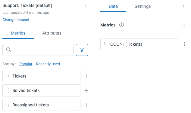
Step 2: Add your metric
Metrics are the foundation of any report. In a pie chart, your metric represents the total "pie" that gets divided into slices.
In the left panel, make sure the Metrics tab is selected. You'll see a list of available metrics organized by category. You can browse through them or use the search bar to find what you need.
For most pie charts, Ticket Count is the go-to metric (see all available metrics). It simply counts the number of tickets, which you can then break down by various attributes. Other common metrics include:
- Solved tickets: Count of resolved tickets
- CSAT responses: Number of satisfaction ratings received
- First reply time: Average time to first response
Drag your chosen metric from the list into the Metrics panel on the right. Or click the plus sign next to the metric name to add it.
Step 3: Add an attribute to break down your data
Now comes the key step for any Zendesk Explore report pie chart breakdown: adding an attribute that defines how your pie gets sliced.
Switch to the Attributes tab in the left panel. Attributes are categories that segment your metric. For a pie chart, you want an attribute with a manageable number of distinct values (ideally 5-7 categories).
Good attribute choices for pie charts include (learn more about attributes in Zendesk Explore):
- Ticket Channel: Email, chat, phone, web form, API
- Ticket Priority: Urgent, high, normal, low
- Ticket Status: New, open, pending, solved, closed
- Assignee: Individual agent names (if you have a small team)
- Group: Team or department names
Drag your chosen attribute to the Rows panel (in the classic builder) or the View by panel (in the beta builder when using chart visualizations). This tells Explore to break down your metric by this category.

Step 4: Change the visualization to pie chart
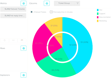
By default, Explore shows your data as a table. To turn it into a pie chart, click the visualization button above your results (it currently shows "Table").
In the visualization menu, find the Comparison of parts category and select Pie. The chart will render immediately, showing your metric broken down by the attribute you selected.
Here's the key requirement for pie charts: your time interval must be set to None. Pie charts show proportions of a whole at a single point in time, not trends over time. If you have a time attribute in your report, remove it or the pie chart option won't be available.
Each slice represents one value from your attribute. The size of the slice corresponds to that category's share of the total.
Step 5: Customize your pie chart appearance
A default pie chart works, but customizing it makes your data clearer and more professional. Click the Chart configuration icon (gear symbol) to access customization options.
Colors: In the Colors section, you can change the color palette or customize individual slice colors (see color customization options). Choose colors that are distinct enough to tell slices apart at a glance.
Displayed values: Decide whether to show percentages, raw values, or both. Percentages are usually most helpful for pie charts since they immediately show proportional relationships.
Color legend: Enable this to display a legend showing what each color represents. This is especially useful if you have several slices or if slice labels would clutter the chart.
Combined metric (donut view): Check this option to convert your pie chart to a donut chart. Donut charts have a hole in the center, which some people find cleaner. You can also display a total value in the center.
Top/bottom filter: If your attribute has too many values (say, 20 different agents), use this filter to show only the top 5 or 10, grouping the rest as "Other." This keeps your chart readable (learn about filtering options).
Step 6: Filter and refine your data
Raw ticket data often includes information you don't want in your pie chart. Filters help you focus on exactly what matters.
To add a filter, drag an attribute to the Filters panel instead of Rows. For example, you might filter to show only tickets from the last 30 days, or only tickets assigned to a specific group.
You can also copy an attribute from Rows to Filters if you want to restrict which values appear without removing the breakdown. Click the three dots next to an attribute in the Rows panel and select "Copy to Filters."
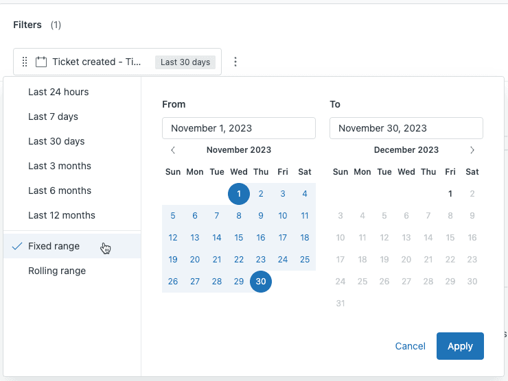
When filtering by date, you have two options:
- Fixed range: A specific start and end date (November 1-30, 2025)
- Rolling range: A dynamic period (last 30 days, last quarter) that updates automatically
Rolling ranges are usually better for reports you'll reference regularly, while fixed ranges work for one-time analyses.
Common pie chart use cases for support teams
Now that you know how to build a Zendesk Explore report pie chart breakdown, here are practical ways support teams use them:
Ticket volume by channel: See what percentage of tickets come from email, chat, phone, web forms, and social media. This helps you allocate resources to the channels customers actually use.
Priority distribution: Understand how urgent your workload is. If 60% of tickets are marked urgent, you might have a priority definition problem.
Resolution by agent group: Compare how different teams contribute to overall ticket volume. Useful for capacity planning and identifying imbalances.
CSAT rating breakdown: Visualize the proportion of good versus bad satisfaction ratings. A pie chart makes it immediately clear if you have a satisfaction problem.
Tag analysis: See which issue types occur most frequently by reporting on common tags. This identifies training needs and product improvement opportunities.
When to skip the pie chart: If you have more than 7-8 categories, consider a bar chart or treemap instead. Pie charts become hard to read when slices get too small.
Tips and troubleshooting
Even with clear steps, things don't always go as expected. Here are solutions to common problems:
Start with a table: Before switching to a pie chart, verify your data in table view. Make sure the numbers look reasonable and your attribute values are what you expect.
Limit your slices: If your pie chart has 15 tiny slices, it's not communicating anything useful. Use the top/bottom filter to focus on the largest categories.
Pie chart won't render: Check that your time interval is set to "None." Pie charts can't display time-based data. Remove any date attributes from your report.
Data looks wrong: Double-check that your metric and attribute make sense together. "Average first reply time by ticket channel" works. "Sum of ticket IDs by priority" probably doesn't.
Consider a donut chart: When you want to emphasize the total number ("847 tickets this month") alongside the breakdown, the donut chart's center space is perfect for displaying that total.
Label clearly: Always enable either slice labels or a color legend. A pie chart without labels is just colorful circles without meaning.
Saving and sharing your report
Once your pie chart looks right, save it for future use. Click the pencil icon next to "New report" at the top to give it a descriptive name like "Ticket Volume by Channel - Monthly."
Click Save to store the report in your Reports library. From there, you can:
- Add to dashboards: Combine multiple reports into a dashboard for at-a-glance monitoring
- Schedule delivery: Set up automated emails with your report on a daily, weekly, or monthly schedule
- Export: Download as PNG for presentations, PDF for reports, or CSV for spreadsheet analysis
Saved reports update automatically when your Zendesk data changes, so your pie chart always reflects current information.
Going beyond pie charts with eesel AI
Pie charts in Zendesk Explore are excellent for understanding what happened in your support queue. They show you the breakdown of tickets, channels, and priorities. But they don't tell you why those patterns exist or what you should do about them.
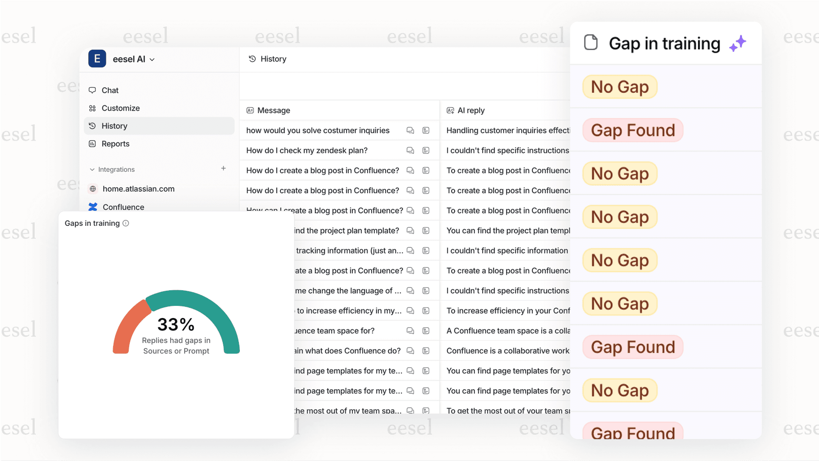
eesel AI integrates directly with Zendesk to analyze your ticket content, not just the metadata. While your pie chart shows that 40% of tickets come from chat, I can tell you that most of those chat tickets are about password resets, and suggest creating a self-service article to deflect them.
Here's how I complement your Zendesk Explore reports:
- Automatic categorization: Instead of relying on agents to tag tickets correctly, I read the content and categorize automatically
- Trend identification: Spot emerging issues before they show up in your monthly reports
- Actionable insights: Get specific recommendations for reducing ticket volume, not just data about it
If you're already investing time in building Zendesk Explore reports, adding me to your team gives you the context to act on what those reports reveal. You can connect your Zendesk account and start seeing deeper insights within minutes.
Frequently Asked Questions
Share this article

Article by
Stevia Putri
Stevia Putri is a marketing generalist at eesel AI, where she helps turn powerful AI tools into stories that resonate. She’s driven by curiosity, clarity, and the human side of technology.