Support leaders have a data problem. Your team generates hundreds or thousands of tickets daily, but raw numbers don't tell you where to focus. Are agents overwhelmed? Are SLAs at risk? Which issues keep coming back? Without the right dashboards, you're flying blind.
This guide walks you through building Zendesk Explore dashboards that actually help you manage. We'll cover the essential dashboards every support leader needs, the metrics that matter, and step-by-step instructions to get you started. We'll also look at how you can complement Explore's historical reporting with AI-powered insights for a more complete picture.
What Are Zendesk Explore Dashboards?
Zendesk Explore (now branded as Zendesk Analytics) is the reporting and analytics platform built into Zendesk. It lets you visualize your support data through dashboards, which are collections of widgets showing reports, charts, filters, and text.

There are two types of dashboards:
- Prebuilt dashboards: Ready-made reports included with your Zendesk plan. These cover common scenarios like ticket volume, agent performance, and customer satisfaction. All users can view them.
- Custom dashboards: Reports you build yourself using the metrics and attributes that matter to your specific operation. Available on Professional and Enterprise plans.
To work with dashboards, you need to understand a few core concepts from the Zendesk documentation:
- Datasets: Collections of data from different Zendesk products (Support tickets, Chat conversations, Knowledge base articles)
- Metrics: Quantitative data like ticket counts, reply times, or resolution times
- Attributes: Qualitative data like agent names, ticket channels, or priority levels
- Widgets: The building blocks of dashboards, including charts, tables, filters, and text
One important note: Zendesk is currently migrating from the legacy dashboard builder to a new builder released in November 2024. The legacy builder will become view-only on December 31, 2026, so if you're building dashboards now, use the new builder to avoid rework.
Essential Dashboards Every Support Leader Needs
Not all dashboards are created equal. Here are the four dashboards that give you the most visibility into your operation.
Live Ticket Queue Dashboard
This dashboard shows what's happening right now. It's essential for operations teams managing daily workflow and making real-time staffing decisions.
Key metrics to include:
- New tickets in the last 30/60 minutes
- Open tickets waiting for a response
- Unassigned ticket count
- Agents currently online
- Average wait time
This dashboard is particularly valuable during high-volume periods or when you need to decide whether to pull agents from other queues. With Zendesk Enterprise, these metrics update in real time. On lower tiers, data refreshes hourly or daily.
Team Performance Dashboard
Use this dashboard for weekly standups and team reviews. It tracks trends over time so you can spot patterns and celebrate wins.
Key metrics to include:
- Tickets solved (weekly/monthly trend)
- First reply time average
- Full resolution time
- CSAT score trend
- Ticket backlog growth or reduction
The goal here is consistency. A single bad week isn't a crisis, but three weeks of declining CSAT or rising resolution times signals a problem worth investigating.
Agent Performance Dashboard
This dashboard gives you visibility into individual productivity and workload distribution. It's perfect for 1:1s and performance coaching.
Key metrics to include:
- Tickets solved per agent
- One-touch ticket rate (tickets resolved in a single interaction)
- Oldest assigned tickets per agent
- Average handle time
- CSAT by agent
Be careful with how you use this data. The goal isn't to rank agents against each other, it's to identify who needs support, who's ready for more complex tickets, and whether workload is distributed fairly.
SLA Compliance Dashboard
This dashboard monitors whether you're meeting your service level agreements. It's essential for executive reporting and quality assurance.
Key metrics to include:
- SLA achievement rate (percentage of tickets meeting targets)
- SLA breaches by priority
- First time to resolution by priority
- Tickets approaching SLA breach
- Breach reasons (if tracked)
If you're reporting to leadership, this is often the dashboard they care about most. Make sure it clearly shows whether commitments are being met and highlights any concerning trends.
Key Metrics to Track in Your Dashboards
With so many metrics available, it's easy to overwhelm yourself with data. Here's a focused list of the metrics that actually drive decisions:
| Metric | What It Measures | Why It Matters |
|---|---|---|
| Ticket Volume | Total tickets created and solved | Capacity planning and trend identification |
| First Reply Time | Time from ticket creation to first agent response | Customer expectations and responsiveness |
| Full Resolution Time | Time from creation to final resolution | Overall efficiency and customer satisfaction |
| CSAT | Percentage of customers rating support positively | Quality measurement and customer loyalty |
| One-Touch Ticket Rate | Tickets resolved in a single interaction | Efficiency and self-service effectiveness |
| SLA Achievement | Percentage of tickets meeting service targets | Commitment tracking and operational health |
When choosing metrics, ask yourself: "What decision will I make based on this number?" If you can't answer that, the metric probably doesn't belong on your primary dashboard.
Also, be mindful of your audience. Executives want high-level trends and SLA compliance. Team leads want workload visibility and performance patterns. Agents want to understand their own productivity and progress. Build separate dashboards for each audience rather than trying to serve everyone with one overloaded view.
Building Your First Dashboard: Step-by-Step
Let's walk through creating a simple Team Performance dashboard. This process works for any dashboard you want to build.
Step 1: Choose Your Dataset
Every report starts with a dataset. For ticket-related reports, you'll typically use:
- Support: Tickets for most ticket metrics (volume, status, resolution times)
- Support: Updates History for agent activity and ticket changes
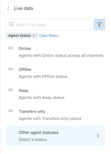
- Live Data for real-time metrics (Enterprise plans)
For our Team Performance dashboard, select Support: Tickets.
Step 2: Create a Report
Now you'll build the underlying report that powers your dashboard widget.
- Select your metrics. For a basic performance report, choose Tickets Solved.
- Add attributes to break down the data. Add Ticket Solved - Date and group it by week.
- Apply filters to focus on relevant data. Add a filter for Time - Ticket Solved = Last 30 days.
- Choose your visualization. A line chart works well for trends over time.
Save your report with a clear name like "Tickets Solved - Weekly Trend."
Step 3: Build the Dashboard
With your report saved, you can add it to a dashboard.
- Create a new dashboard from the Explore library.
- Add your saved report as a widget.
- Arrange and resize the widget to fit your layout.
- Add global filters that apply to all widgets, like date ranges or ticket groups.
- Repeat the process to add more widgets (First Reply Time trend, CSAT scores, etc.).
Keep your layout clean. White space helps viewers focus on what matters. Group related metrics together and use consistent colors and formatting.
Step 4: Share with Stakeholders
By default, only you and other admins can see your new dashboard. To make it useful, you need to share it.
- Set permissions for each user: Admin (full control), Editor (can modify), or Viewer (can only view).
- Send email invitations to specific team members.
- Set up scheduled deliveries if you want the dashboard emailed automatically (available on Professional and Enterprise plans).
Remember that sharing settings don't transfer when you migrate to the new dashboard builder. If you're planning a migration, document your current shares so you can recreate them.
Common Mistakes and How to Avoid Them
After helping hundreds of support teams set up their reporting, we've seen the same mistakes repeatedly. Here's how to avoid them:
Dashboard clutter. Too many widgets make dashboards hard to read. Limit yourself to 6-8 key metrics per dashboard. If you need more, create separate dashboards for different purposes.
Wrong dataset selection. Choosing the wrong dataset leads to confusing or incorrect results. If you're reporting on ticket changes over time, use Updates History, not Tickets. If you're tracking current queue status, use Live Data.
Ignoring data refresh schedules. Data doesn't update instantly on most plans. Team plans refresh every 24 hours, Professional plans every hour, and only Enterprise plans get real-time live dashboards. Don't panic over "stale" data if you're on a lower tier.
Missing the migration timeline. If you're still building dashboards in the legacy builder, you're creating rework for yourself. The new builder has been available since November 2024, and legacy dashboards become view-only at the end of 2026.
Forgetting to share. A dashboard only you can see isn't helping anyone. Make sharing part of your dashboard creation process, not an afterthought.
Going Beyond Explore: Adding AI-Powered Insights
Explore excels at showing you what happened. It tells you how many tickets you solved, what your CSAT was, and whether you hit your SLAs. But it doesn't tell you what will happen or what you should do about it.
AI-powered tools can fill this gap. While Explore shows historical trends, AI analytics can:
- Predict ticket volume spikes before they happen
- Identify knowledge gaps that are driving repeat contacts
- Surface automation opportunities you might have missed
- Analyze sentiment and intent at scale

We built eesel AI to complement platforms like Zendesk with forward-looking insights. Our AI teammate analyzes your past tickets, help center articles, and macros to identify patterns Explore might miss. You can run simulations on historical data to see how changes would have performed, or get recommendations for improving your knowledge base based on actual customer questions.
The two approaches work best together. Use Explore for your regular reporting and operational dashboards. Use AI analytics when you need to understand why trends are happening or what to do about them.
Start Building Better Dashboards Today
You don't need to build everything at once. Start with one dashboard that solves your most pressing visibility problem. Maybe that's a live queue view if you're managing daily operations, or an SLA compliance dashboard if you're reporting to leadership.
Focus on metrics that drive decisions, not metrics that just look interesting. And remember that dashboards are living documents. Review them monthly, remove what you don't use, and add what's missing.
If you're using Zendesk, you already have powerful analytics tools at your disposal. Make sure you're taking full advantage of them. And if you want to go deeper, with predictive insights and AI-powered analysis, explore how eesel AI can enhance your reporting.