Survey analysis: how to turn responses into decisions
Riellvriany Indriawan
Katelin Teen
Last edited July 4, 2026

What survey analysis actually is
Every survey asks two kinds of questions, and each needs a different kind of analysis.
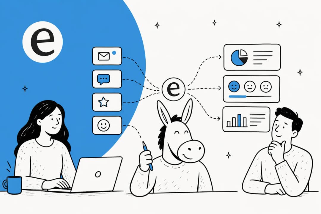
Closed-ended questions (rating scales, multiple choice, yes/no) give you numbers you can count, average, and benchmark. Open-ended questions (the comment box) give you the reasons behind those numbers, but they arrive as unstructured text, so you have to code them into themes before you can count anything.
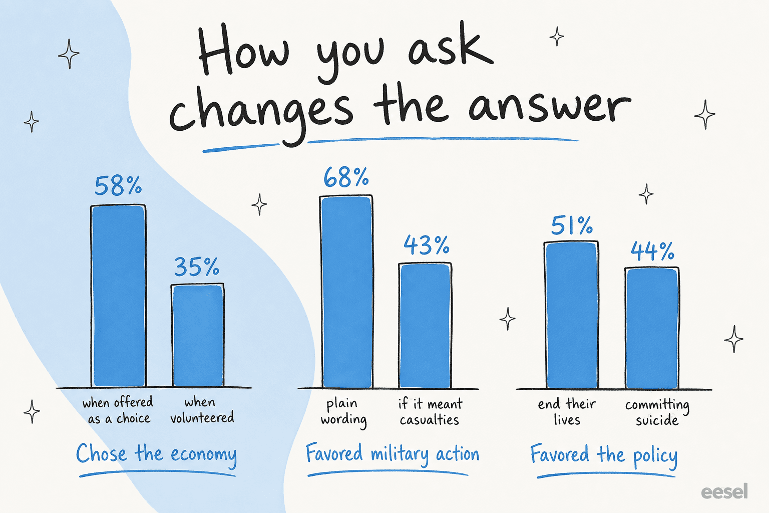
The two are not interchangeable, and the gap between them is bigger than most people expect. Pew Research ran the same question both ways and found that when respondents were explicitly offered "the economy" as a choice, 58% picked it, versus only 35% who volunteered it unprompted. A striking 43% of open-ended respondents gave an answer that was not on the closed-ended list at all. Skip the open text and you are systematically blind to the things you did not already think to ask about.
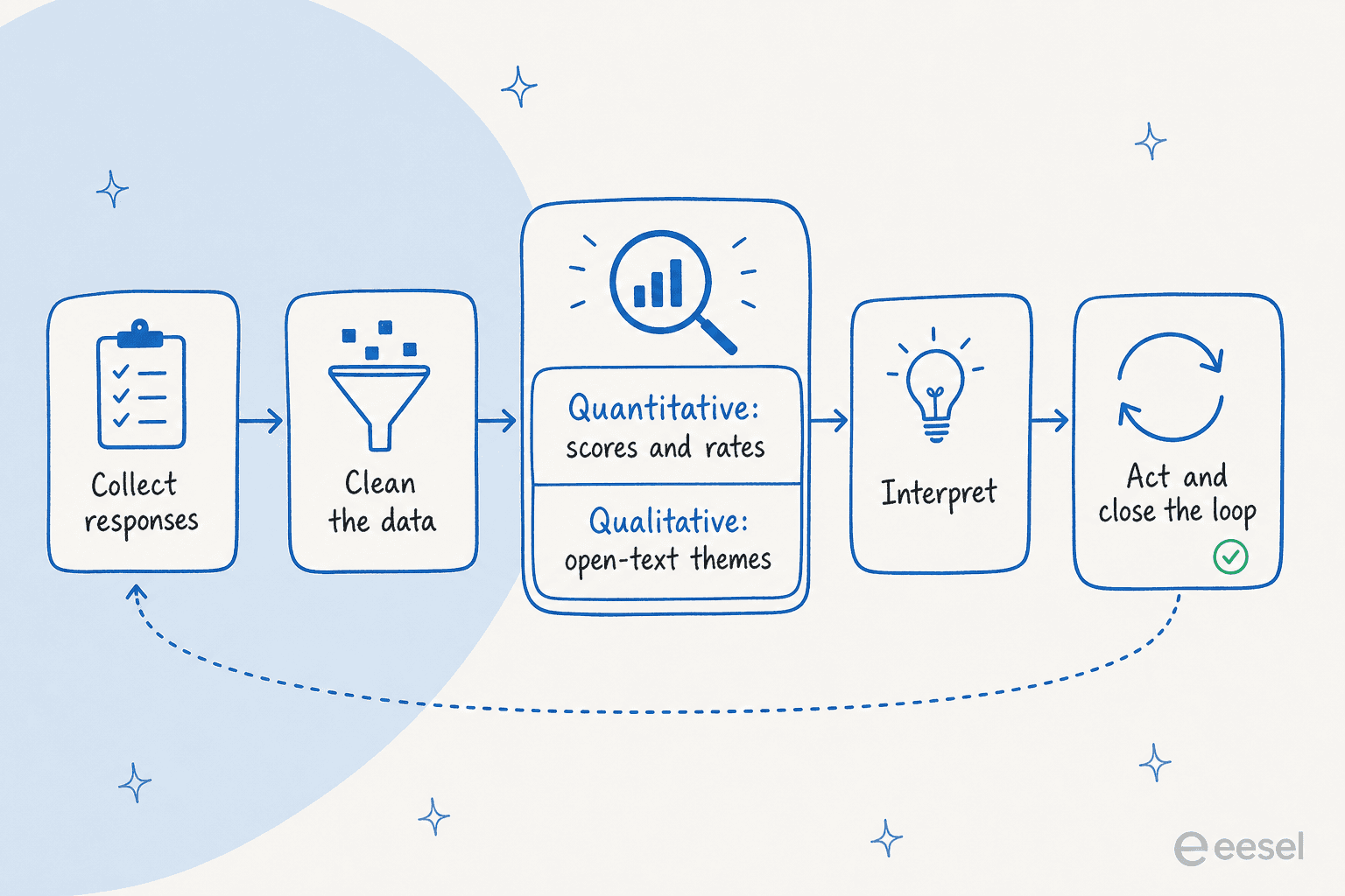
Here is the full loop, start to finish.
Start with the metric that matches the question
Before you analyze anything, know which metric you are actually computing, because NPS, CSAT, and CES answer very different questions.
- NPS (Net Promoter Score) asks how likely someone is to recommend you, on a 0 to 10 scale. You subtract the percentage of Detractors (0 to 6) from Promoters (9 to 10), which lands you somewhere between -100 and +100. It reads the overall relationship.
- CSAT (Customer Satisfaction Score) asks how satisfied someone was, usually on a 1 to 5 scale. You count the top two boxes (4 and 5) as a percentage of all responses, because the two highest values are the most accurate predictor of retention. It reads a single, recent experience.
- CES (Customer Effort Score) asks how easy it was to get something done. Back in 2010, CEB researchers found reducing effort predicts loyalty better than "delighting" customers, reporting that 96% of customers with a high-effort interaction became more disloyal. It reads friction.
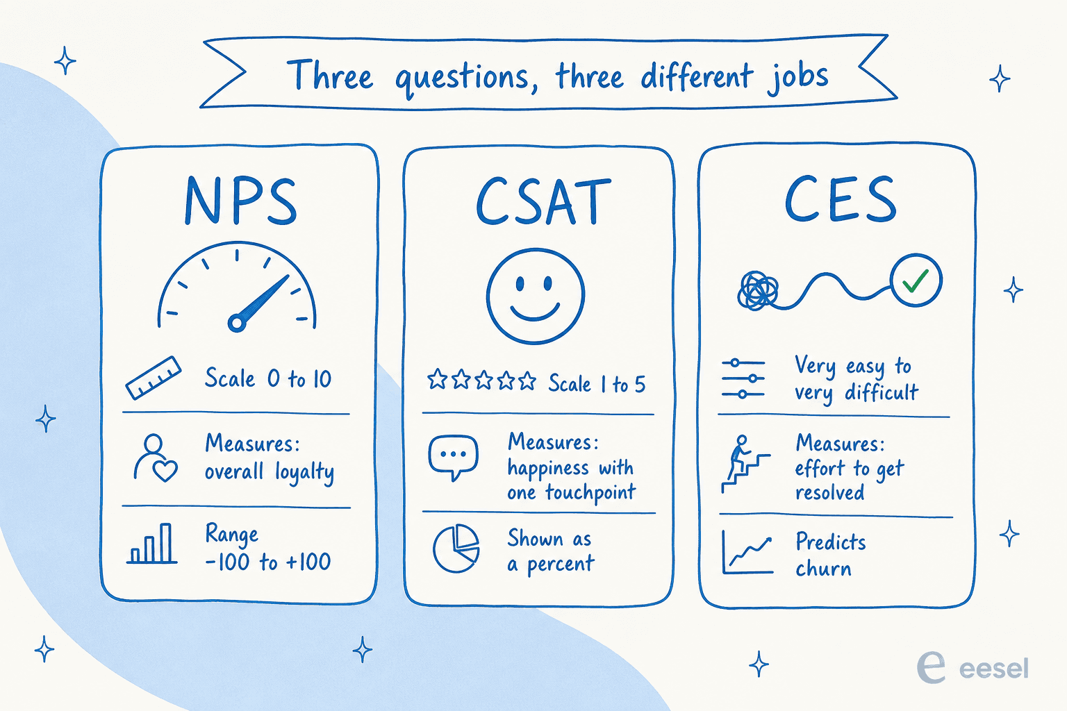
None of these is "the" customer metric, and picking the wrong one quietly distorts your whole analysis. If you want the longer version of how they slot together, we broke it down in our guide to customer service KPIs and the specifics of CSAT and customer effort score.
The quantitative pass: counting, slicing, and not fooling yourself
The numeric side is the easy part, and it is mostly three moves.
Tabulation is just counting: how many people chose each option, as a frequency and a percentage. Cross-tabulation slices one question by another, so you can compare, say, satisfaction between long-term and new customers. SurveyMonkey's rule of thumb is that the question that affects the other goes in the columns, and the one being explained goes in the rows. Significance testing (usually a Chi-square test) tells you whether a difference between groups is real or just noise.
That last step is where teams fool themselves. A crosstab difference you did not significance-test might be random variation, and a small sample carries a large margin of error, so an apparent gap can vanish on the next run.
Which raises the question everyone asks too late: how many responses do I actually need? Plug in your numbers.
The non-obvious bit: required sample size levels off for large populations. After roughly 100,000 people, you need about the same number of completes no matter how big the audience gets. And keep your response rate honest, because the percentage who submit a complete response is a different number from the percentage who start.
One rule that survives every analysis: correlation is not causation. A Chi-square test is a correlation test for categorical variables; it tells you two things move together, not that one causes the other. Long-tenure customers reporting higher satisfaction does not mean tenure creates satisfaction.
The qualitative pass: where most analysis quietly dies
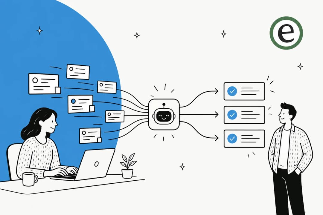
The comment box holds your best insight and takes the most work, which is exactly why it gets skipped. The manual method is real coding: read every response, group them into recurring themes, then count the themes.
Anyone who has done it knows how brutal that is at volume. From the research community:
"I'd expect a survey of that size to probably take a week or more for analysis and reporting. That's with one person doing that work... and a moderate level of grinding work like coding free responses."
a UX researcher on r/userexperience
This is the part where AI actually earns its keep. Tools like Qualtrics Text iQ apply natural language processing to cluster open text into topics and tag sentiment across thousands of responses at once. The catch, straight from a Qualtrics user, is that sentiment "may not be 100% accurate for every survey response due to subtle nuances," and it is most powerful in aggregate. So treat an AI-built theme list as a strong first pass a human reviews, not as gospel. If you are weighing options here, we compared the best AI customer feedback tools and how AI sentiment analysis works in practice.
Watch your question design, or you are analyzing noise
No amount of clever analysis fixes a badly worded question, because the wording itself moves the answer. Pew has documented this for decades: framing military action plainly drew 68% support, but adding "even if it meant that U.S. forces might suffer thousands of casualties" dropped it to 43%. Same underlying opinion, wildly different number.
A quick checklist of the design mistakes that poison analysis before it starts, all flagged by Pew:
- Leading or loaded wording. "Welfare" versus "assistance to the poor" swings support by over 20 points for an otherwise identical question.
- Double-barreled questions. Asking about two things at once ("domestic and foreign policy") is impossible to answer cleanly and impossible to interpret.
- Acquiescence bias. In agree/disagree formats, unsure respondents drift toward "agree." A forced choice between two statements is safer.
- Too many options. For opinion questions, keep it to four or five choices; people cannot hold more in mind at once.
- Changing wording mid-tracker. If you are comparing to earlier surveys, keep the wording identical, or you are measuring your edits, not your customers.
The real bottleneck is not analysis, it is acting on it
Here is the uncomfortable finding. You can nail the quantitative pass, code every comment, and design flawless questions, and still get nothing out of it, because the data just sits there. The 2% to 3% closed-loop figure is the whole game.
It shows up as a perception gap too. The Qualtrics XM Institute found a 31 percentage-point gap between how well executives think they use customer feedback and how consumers rate it. And customers are noticing: the share who bother to share feedback after a very good experience has dropped about 5 points since 2021.
Your respondents feel the silence:
"Survey fatigue is very real and one of the main contributors to it, particularly in B2C is lack of any feedback once you've completed the survey."
a CX practitioner on r/CustomerSuccess
That is also why response rates keep sliding. NiCE pegs the average emailed relationship survey at 32% for B2B and 13% for B2C, and attributes the decline to fatigue as more companies pile on more surveys. Analysis you never act on is not just wasted effort; it actively trains customers to stop responding.
Your support queue is a survey you are already running
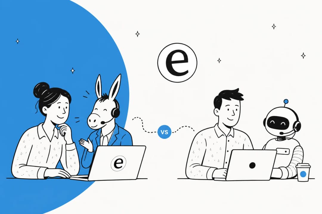
This is the part I care about most, and it is the piece formal survey programs miss. Every support ticket is an unsolicited, unfiltered survey response, and it comes with something a survey never has: the customer's actual words, at the exact moment they hit a problem. No fatigue, no leading questions, no sampling. It is voice of customer data you already own.
The problem is scale. Nobody can read 5,000 tickets a month and pull out themes by hand, which is the same wall that kills open-text survey analysis. This is exactly what we have spent years building at eesel: an AI helpdesk that reads the whole queue, clusters recurring issues, tags sentiment, and drafts answers off your own knowledge base. Before it ever goes live, you can simulate it against thousands of past tickets to see the themes and coverage it finds. And because it reports back the same way a survey tool does, the "what are customers actually struggling with" question stops taking a week.
The same LLM approach that clusters survey open text is what turns a ticket backlog into readable themes. If you want the reporting angle specifically, we wrote up AI customer service metrics, an analytics dashboard template for support, and a broader chatbot analytics guide.
And once the themes are clear, you can act on them directly by having an AI helpdesk agent deflect the recurring ones, route the rest with ticket triage, and escalate cleanly when it should not answer.
Try eesel for the analysis that actually moves the needle
Survey analysis is worth doing well, but the highest-leverage feedback most support teams have is the queue itself. eesel plugs into your helpdesk (Zendesk, Freshdesk, HubSpot, Gorgias, Front, and more), learns from your past tickets and help docs on day one, and turns thousands of raw conversations into recurring themes plus drafted replies. You can simulate it on your historical tickets to see exactly what it would surface and resolve before it touches a live customer, and it is usage-based with no per-seat fees, free to try.
If a week-long open-text coding slog sounds familiar, that is the exact problem worth pointing an AI at first.
Frequently Asked Questions
What is survey analysis?
How do you analyze open-ended survey responses?
What sample size do I need for survey analysis to be reliable?
Which survey metric should I use: NPS, CSAT, or CES?
How can AI help with survey and feedback analysis?

Article by
Riellvriany Indriawan
Riell is a designer and writer at eesel AI with about two years of experience researching CX platforms, AI chatbots, and helpdesk software. She combines her design background with a sharp eye for how these tools actually look and feel in practice — making her comparisons unusually visual and user-focused.