
Let's be real, staring at a dashboard packed with charts sometimes feels like trying to read tea leaves. You see the numbers and trends, but what does it all actually mean? I know I've looked at my Freshdesk dashboard, seen the ticket volumes and CSAT scores, and wanted to find ways to take my insights to the next level. More importantly, I wanted a clear path for what to do next.
That's what sent me down this rabbit hole. I decided to explore five different approaches, from Freshdesk's robust built-in options to slick AI platforms, to build Freshdesk dashboard widgets that give you insights you can actually use. It’s time to stop staring at data and start making it work for you.
What are Freshdesk dashboard widgets?
First, let's quickly cover the basics. Freshdesk dashboard widgets are those visual blocks you see on your main screen displaying key support metrics in real time. Think of them as high-performance windows into the health of your helpdesk.
You probably know the usual suspects: 'Ticket Count' showing the current pile, 'Customer Satisfaction' giving you a vibe check, and the 'Leaderboard' to stir up some friendly competition. Their main job is to give you a quick, at-a-glance look at performance and workload, which is fantastic for day-to-day monitoring.

How to get even more from your standard Freshdesk dashboard widgets
While the standard widgets provide a fantastic foundation for a quick pulse check, there are ways to dig even deeper for strategic planning. Freshdesk provides a clear picture of what is happening, and you can supplement this with additional tools to uncover the "why" or plan your next move.
Here are a few ways I looked to build on the default setup:
-
Complementing historical data with proactive planning: Standard widgets are excellent at telling you what already happened. By pairing this with AI insights, you can see that handling a hundred password reset tickets last week is a great opportunity to create a new help article that empowers customers.
-
Leveraging curated customization: Freshdesk offers a focused set of standard options that are optimized for ease of use. For those who need highly specialized metrics, the Freshdesk ecosystem provides several ways to expand these views.
-
Connecting symptoms to strategic solutions: Your dashboard might flag a spike in billing tickets, which is a helpful signal to check your knowledge base articles. This is where smarter, complementary tools can help you bridge the gap between seeing a trend and implementing a solution.

My criteria for the best tools for Freshdesk dashboard widgets
To make this a fair comparison, I judged each tool against the same five criteria. These are the things I believe matter most for any support team trying to get ahead:
-
Actionable Insights: Does it give you clear recommendations to complement your numbers?
-
Ease of Use: How fast can you get it running and see some value?
-
Customization: How much can you tweak the metrics and visuals to make them your own?
-
Integration Depth: How well does it actually play with Freshdesk and your other tools?
-
Return on Investment (ROI): Is the value it provides, saving time and improving performance, worth the price?
Freshdesk dashboard widgets: A comparison of the top 5 tools
Here's a quick side-by-side look at how the five methods I tested compare.
| Feature | eesel AI | Freshdesk Team Dashboards | Geckoboard | Databox | Freshworks Analytics |
|---|---|---|---|---|---|
| Primary Focus | AI-driven insights & automation ROI | Real-time team monitoring | Centralized KPI visualization | Business intelligence & goal tracking | Advanced native reporting |
| Actionable Insights | High | Direct | Medium | Medium | High |
| Ease of Use | Very High | High | Medium | Medium | Medium |
| Customization | High (for AI workflows) | Focused | High | Very High | High |
| Best For | Strategic process improvement | Daily queue management | Company-wide visibility | In-depth data analysis | Cross-functional Freshworks reporting |
5 tools and methods for better Freshdesk dashboard widgets in 2026
After spending time with each of these, here's my breakdown of the best ways to get more out of your Freshdesk reporting.
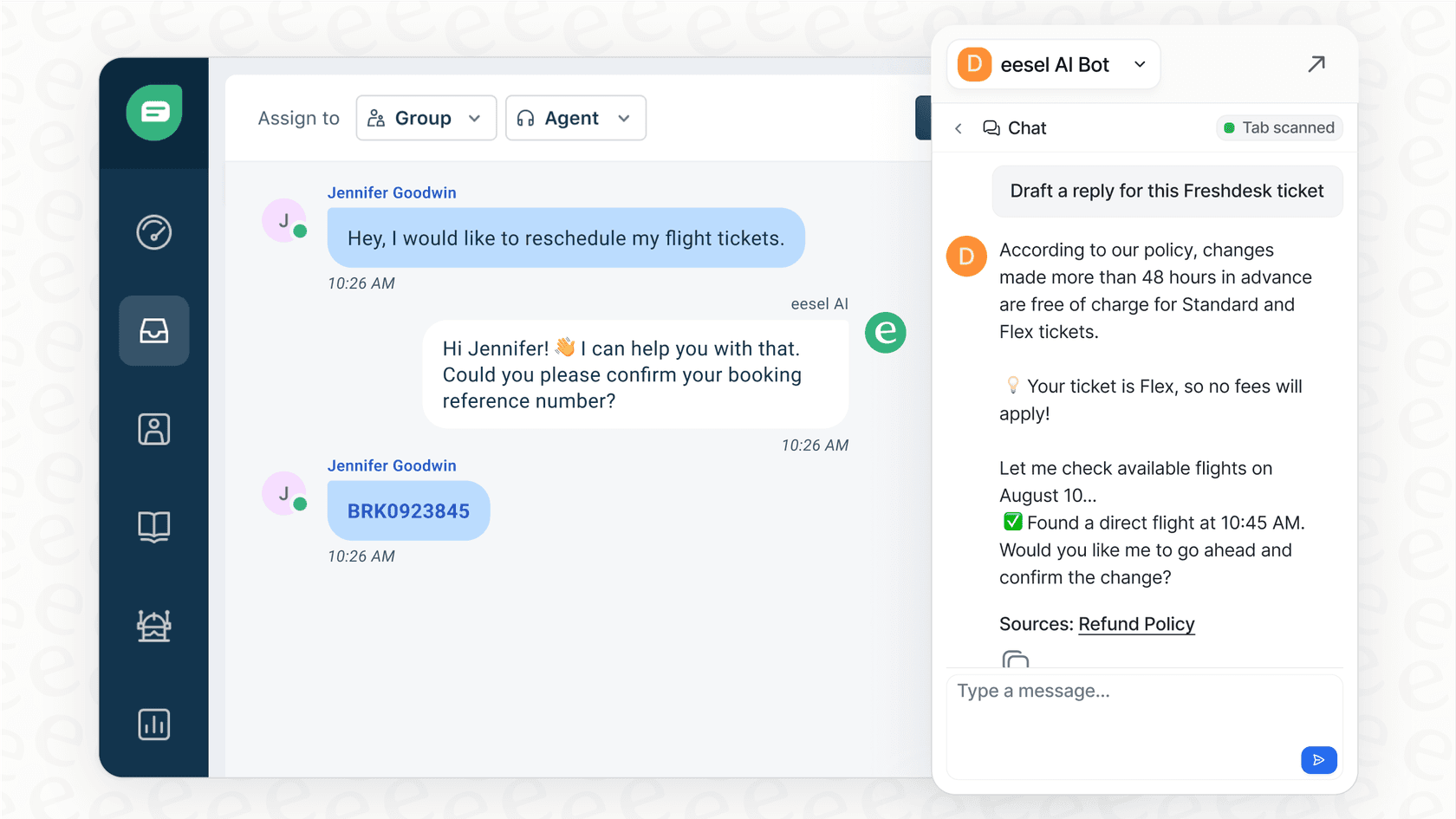
1. eesel AI
First on my list is eesel AI. This is a powerful complementary tool because it works directly within the Freshdesk ecosystem to automate support tickets. The real advantage for me was its analytics dashboard, which serves up specialized insights that perfectly supplement Freshdesk's native reporting. It’s all about the performance of your automation and finding your knowledge gaps.
What really stands out is how eesel AI helps answer "what's next." For example, if you see a mountain of password reset tickets, its reporting shows how many were handled automatically. It also highlights the questions it couldn't answer, acting as a guide for which articles to add to your knowledge base. It feels like having an efficiency assistant working alongside your helpdesk.
What I liked:
-
It provides a clear path for improving your support workflows and automation.
-
It helps calculate the ROI of your AI in terms of time and efficiency.
-
The setup was incredibly easy. I was up and running in a few minutes, perfectly complementing my existing Freshdesk setup.
What to keep in mind:
- It's specialized for AI and automation metrics. If you need a general tool to pull in sales and marketing numbers alongside support data, you might pair it with a BI tool.
Pricing: The pricing for eesel AI is clear and scales with your needs.
-
Team Plan: $299/month ($239/mo if billed annually) for up to 1,000 AI interactions.
-
Business Plan: $799/month ($639/mo if billed annually) for up to 3,000 interactions, adding features like AI actions for ticket triage.
-
Custom Plan: For enterprise-level needs with unlimited interactions and more advanced features.
2. Freshdesk team dashboards
This is the reliable, built-in dashboard feature inside Freshdesk. It lets you create dashboards for different teams using a library of ready-made widgets. It’s a very capable starting point and serves as the trusted heart of many support operations.
For a simple, real-time view of your team's workload and core numbers like ticket volume and CSAT, it works perfectly. It's a solid choice for keeping a finger on the pulse of daily operations and is highly trusted by thousands of companies.

What I liked:
-
It’s part of your Freshdesk plan, providing immediate value.
-
As a native feature, it’s perfectly integrated and incredibly simple to get started with.
-
The leaderboard widget is a great, built-in way to motivate agents.
What to keep in mind:
-
It is designed for streamlined monitoring, providing the most essential widgets out of the box.
-
For very advanced, strategic analysis, you can supplement it with Freshworks Analytics.
Pricing: Included in Freshdesk Pro ($49/agent/month, billed annually) and Enterprise ($79/agent/month, billed annually) plans.
3. Geckoboard
Geckoboard is a third-party tool focused on creating clean, easy-to-read dashboards that are perfect for office visibility. It pulls in data from various apps, including Freshdesk, to display everything in one place.
I included Geckoboard because it’s a great way to make Freshdesk's important support metrics visible to the whole company. If you want to show the sales and marketing teams the impressive volume your support crew is handling, this is a great visual tool.
What I liked:
-
It's excellent for creating shareable dashboards to display on office screens.
-
You can mix Freshdesk data with metrics from other tools for a broader business view.
What to keep in mind:
-
It involves an additional subscription for your support stack.
-
It focuses on high-level visualization rather than the deep native analysis found within the Freshworks suite.
Pricing: Geckoboard's plans scale based on your dashboard needs.
-
Essential: $60/month (billed annually) for 1 dashboard.
-
Core: $175/month (billed annually) for 20 dashboards.
-
Pro: $319/month (billed annually) for 50 dashboards and extra features.
4. Databox
Databox is a comprehensive business intelligence (BI) platform designed to centralize company data. Its Freshdesk integration is robust, allowing you to build specialized widgets and track progress towards specific goals.
This tool is for teams who want to connect Freshdesk data with broader company trends. If you want to see how support performance correlates with other business metrics, Databox provides the tools to build those complex views.
What I liked:
-
It’s a powerful and flexible platform for deep data exploration.
-
The goal-setting and tracking features are well-developed.
What to keep in mind:
-
The depth of the platform means there is a bit more of a learning curve to get started.
-
It is a heavy-duty tool that is best suited for teams with specific, complex data needs.
Pricing: Databox has a few tiers that include unlimited users.
-
Professional: $159/month (billed annually) includes 3 data sources.
-
Growth: $399/month (billed annually) adds more advanced analytics and AI features.
-
Premium: $799/month (billed annually) comes with 100 data sources and enterprise features.
5. Freshworks Analytics
This is an advanced reporting tier within the Freshworks suite. It goes beyond basic Team Dashboards, allowing you to build custom reports and widgets with sophisticated filtering and grouping capabilities.
For teams who are fully invested in the Freshworks ecosystem, this is a powerful native step. It provides a highly capable reporting tool that keeps your data within your existing stack.
What I liked:
-
It is significantly more flexible and powerful for custom reporting.
-
It offers deep integration with other products in the Freshworks family.
What to keep in mind:
-
It offers professional-grade depth, which may take a little time to master.
-
It is built specifically for the Freshworks universe, providing a cohesive experience for users within that ecosystem.
Pricing: Included with higher-tier Freshworks plans. You can check your plan or consult their sales team for specific details on access.
How to choose the right tool for your team
After exploring these options, it’s clear that Freshdesk provides an amazing foundation that can be expanded based on your goals. Here are a few pointers to help you find the right setup.
Pro tip
Define your primary goal. If you are focused on daily ticket management, Freshdesk's native tools are excellent. To share metrics company-wide, a visual tool like Geckoboard is a great addition. For specialized process improvements, look for tools that offer complementary intelligence.
Pro tip
Look for tools that highlight opportunities. Freshdesk's dashboards show you important trends, and you can pair them with tools that suggest the best path forward, such as identifying a need for a new help article.
Pro tip
Prioritize actionable data. The best Freshdesk dashboard widgets help you decide what to do next. Whether it's showing how much time you've saved through automation or pinpointing where to focus your training, the goal is to use your data to drive positive change.
From data overload to clear action
Your Freshdesk dashboard is a powerful tool for success. While the native widgets give you a reliable and trusted starting point for daily monitoring, and BI tools offer extensive customization, you can truly excel by adding specialized intelligence to the mix.
When you use tools that complement Freshdesk's strengths, your reporting becomes a strategic asset. You're not just tracking metrics; you're actively finding ways to make your support even better. The best approach is to find a setup that shows you exactly how to reach your goals.
That’s where a solution like eesel AI really adds value. It works alongside Freshdesk to show you the biggest opportunities for automation and improvement. If you're curious about how much of your support could be further streamlined, you can even run a free simulation on your data to see the potential.
Frequently asked questions
How can I make my Freshdesk dashboard widgets provide more actionable insights?
To get actionable insights from your Freshdesk dashboard widgets, look for tools that supplement your data with deep analysis of the 'why' behind it. Solutions like eesel AI can highlight automation opportunities or knowledge base gaps, transforming numbers into a clear to-do list for improvement.
Are the standard Freshdesk dashboard widgets enough for daily support team management?
The standard Freshdesk dashboard widgets are excellent for real-time monitoring of daily operations like ticket volume and CSAT. For teams requiring specialized, custom metrics or advanced trend analysis, they can be easily paired with other tools in the Freshdesk ecosystem.
What's the main benefit of using a third-party tool for Freshdesk dashboard widgets over the native options?
Third-party tools offer additional layers of customization and the ability to integrate with data from other business platforms. This allows you to build highly specific dashboards that complement native Freshdesk dashboard widgets to track unique KPIs for your business.
Can Freshdesk dashboard widgets help me identify areas where my knowledge base is lacking?
Yes, advanced Freshdesk dashboard widgets, especially those from AI-driven platforms like eesel AI, can do this. They analyze ticket interactions to pinpoint common questions, helping you identify where new knowledge base articles can further assist your customers.
Is it possible to create highly customized Freshdesk dashboard widgets that track unique team goals?
Absolutely. Freshdesk provides a solid set of native widgets, and tools like Freshworks Analytics or Databox allow for even more extensive customization. These platforms enable you to build bespoke widgets and reports tailored to specific team goals and complex metrics.
How do I choose the right tool for creating effective Freshdesk dashboard widgets for my team?
Begin by defining what insights you truly need. Prioritize tools that offer actionable recommendations and align with your team's specific goals, whether it's daily monitoring, company-wide visibility, or deep operational improvements.