So, you’ve brought AI into your support team. The promise was big: lower costs, faster resolutions, and happier customers. But now for the tricky part, proving it’s actually working. Too many teams get stuck staring at a "deflection rate" metric, which sounds impressive but often hides the real story. Your standard dashboards can show you what’s happening, but they rarely explain why or what you should do next.
The answer isn’t to wrestle with a generic business intelligence (BI) tool that takes a data scientist and a few months to set up. It’s to use an analytics dashboard template for AI performance in support that’s built for the job. This isn't just about tracking numbers. It’s about getting a real handle on efficiency, quality, and how your operations are improving in a way you can actually use.
This guide will walk you through what goes into a solid AI analytics dashboard, how to build one, and why an all-in-one AI platform is a much smarter move than trying to glue everything together yourself.
What is an analytics dashboard for AI performance in support?
Think of an analytics dashboard for AI performance in support as mission control for your support automation. It’s a single screen designed to measure how effective your AI agents and copilots are and what kind of impact they’re having on the business.
It’s completely different from the dashboards you’re probably used to. The ones in your helpdesk are built for human agents, tracking things like First Contact Resolution (FCR) and Average Handle Time (AHT). They were designed for a world before AI. On the flip side, general BI dashboards are powerful, but they’re blank canvases. You have to figure out what AI support metrics to track, and then you need a lot of technical skill to build the reports from scratch.
A dedicated AI performance dashboard is built to give you clear, useful insights in three main areas:
-
Efficiency: Is the AI solving tickets and giving your team time back?
-
Quality: Are customers happy with the AI's answers, or are they getting frustrated and leaving?
-
Improvement: What can you learn from the AI about your customers, your knowledge base, and your own processes?
Key components of a powerful AI performance dashboard
A useful dashboard is more than just a bunch of charts. It’s about tracking the right KPIs that tie your AI’s performance directly to your business goals. Here’s what you should be measuring.
Measuring efficiency and cost savings
This is all about showing the return on investment and making sure the AI is doing its job.
-
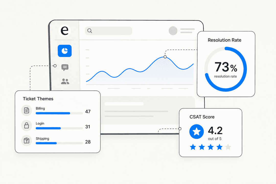
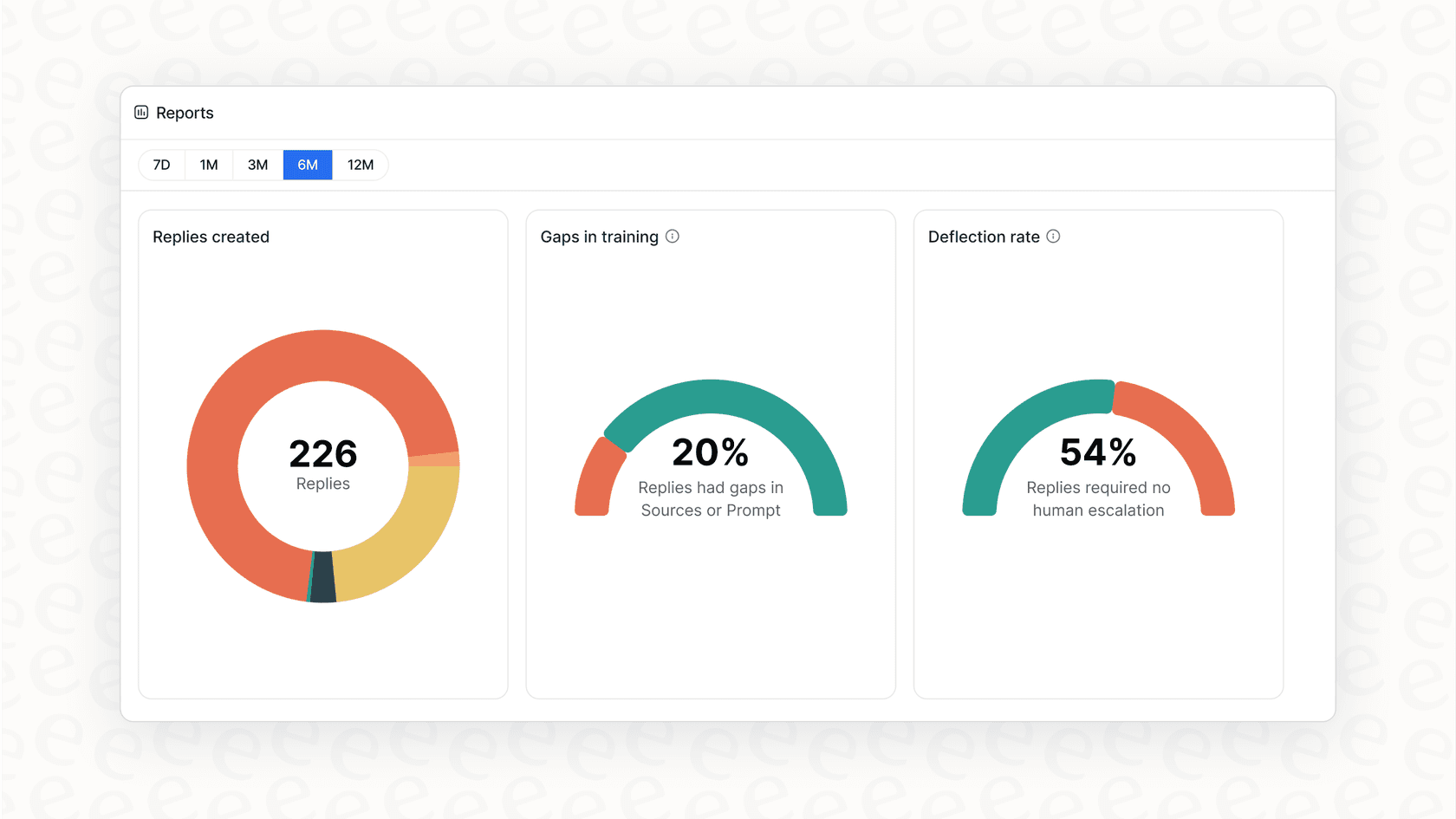
Automated resolution rate: This is your most important metric. It’s the percentage of tickets the AI closes without a human ever touching them. Anything less is just noise.
-
Ticket deflection vs. true resolution: It’s really important to understand the difference here. "Deflection" can be a misleading number. If a customer gets annoyed with a bot and just sends an email instead, was the ticket really deflected? True resolution means the customer’s problem is solved, and they don’t have to try contacting you again.
-
Cost per automated resolution: You need to know this to calculate your ROI. How much does it cost for your AI to solve a problem compared to a human agent? This can get messy if your AI provider has a "per-resolution" pricing model, because your costs can jump around unexpectedly. It’s much easier with a platform like eesel AI, which offers clear, interaction-based pricing. This makes calculating your real cost savings simple, without any surprise bills.
-
Reduction in agent first response time: When AI handles all the simple, repetitive questions, your agents are free to work on the tougher issues. A good dashboard will show you how the AI is shrinking the queue and helping your team get to high-priority tickets faster.
Measuring quality and customer satisfaction
Saving time doesn't matter if you're just making customers angry. Quality metrics tell you if your AI is actually helping.
-
CSAT/NPS on AI interactions: The easiest way to check quality is to just ask. After an AI solves a ticket, send a quick CSAT or NPS survey. You’ll get direct feedback on whether customers are happy with the automated help.
-
Escalation rate: What percentage of conversations that start with the AI get handed off to a human? A high escalation rate might mean your AI is having trouble understanding people or doesn’t have the right information to give good answers.
-
Negative response rate: This keeps an eye on how often customers say things like "that didn't help" or "I need a person" right after the AI responds. It’s a great way to spot customer frustration as it happens.
Measuring knowledge and operational improvement
A smart AI doesn't just answer questions, it helps you improve. Your dashboard should be a tool that helps you get better over time.
-
Knowledge gaps identified: Your dashboard should point out exactly where your knowledge base is weak. When the AI can’t find an answer, that’s a clear sign you need to write or update an article on that topic. This is a core feature of eesel AI, whose reports automatically show you these content opportunities, turning your support data into a roadmap for improvement.
-
Automated knowledge base generation: This is where it gets really interesting. Modern platforms like eesel AI don't just find the gaps; they help you fill them. By looking at how your human agents successfully solve tickets, the AI can draft new help center articles for you. Your dashboard becomes a tool for your content strategy, making sure you’re creating articles that people actually need.
-
Topic and intent coverage: The dashboard should show you what percentage of incoming ticket topics the AI is set up to handle. This gives you a clear picture of your automation progress and helps you decide what to automate next.
| Traditional Support Metric | Corresponding AI Performance Metric | Why It Matters for AI |
|---|---|---|
| First Contact Resolution (FCR) | Automated Resolution Rate | Measures if the AI can solve issues all by itself. |
| Average Handle Time (AHT) | Time Saved Per Interaction | Shows the efficiency gains your team gets. |
| Agent CSAT | CSAT on AI Interactions | Directly tracks if customers are happy with the AI. |
| Ticket Volume | Escalation Rate | Shows how well the AI keeps tickets away from your agents. |
How to create an AI performance dashboard
Building a dashboard that’s actually useful is about more than just picking software. You need to think about your data, your tools, and how you'll roll it out.
Step 1: Bring your scattered data sources together
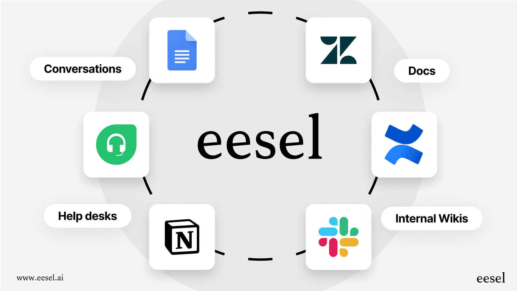
One of the biggest hurdles for support AI is that company knowledge is usually all over the place. You’ve got official docs in your helpdesk like Zendesk or Freshdesk, internal how-tos in Confluence or Notion, quick answers in Slack, and important details buried in a sea of Google Docs. An AI is only as good as the information it can get to.
This is where a platform like eesel AI really helps. Instead of spending months on a massive data migration project, you can use eesel AI’s one-click integrations to connect all of those sources instantly. It pulls everything together into one brain for the AI to learn from, which means your dashboard reports will be based on the complete picture.
Step 2: Choose how you'll build your dashboard
You basically have two ways to go here:
-
The DIY approach: You could use a general BI tool like Power BI or Zoho Analytics. This gives you total freedom to build whatever you want, but it comes with a price. You'll need a good bit of technical help, probably a data analyst, to connect all the data, define the metrics from scratch, and build every single chart. It’s a powerful option, but it's also slow and expensive for building your analytics dashboard template for AI performance in support.
-
The built-in approach: The faster, more practical option is to use an AI platform that comes with its own reporting. The dashboard is already set up with the KPIs that matter for support automation, so you can spend your time on insights, not setup.
Step 3: Simulate performance before you go live
Launching an AI without knowing how it will do is a big gamble. What if it gives wrong answers? What if it just makes customers mad? This is where newer AI platforms are miles ahead of older ones.
eesel AI's simulation mode pretty much solves this problem. Before you let the AI touch a single live ticket, you can have it run through thousands of your past conversations. After it’s done, eesel AI gives you a detailed performance dashboard showing your predicted automated resolution rate, potential cost savings, and a full list of topics it can handle. It’s a no-risk way to check your setup and build a solid business case for automation based on your own data.

Common dashboard tools and their limits
Let's take a closer look at the tools you might consider for your analytics dashboard template for AI performance in support and why a specialized, integrated platform is almost always a better bet.
The general BI tool approach: Zoho Analytics
Tools like Zoho Analytics are fantastic for general business reporting. You can connect them to almost anything and build custom dashboards for sales, marketing, finance, or any other team.
For tracking AI performance in support, though, they have some real drawbacks:
-
A lot of setup work and cost: They’re blank slates. You or a data analyst will have to manually connect to your systems, write code to define every metric (like "automated resolution" or "knowledge gap"), and build every chart from the ground up. This can easily take weeks or months.
-
Not specialized for the job: These tools don't get the nuances of support AI. They don’t have built-in ideas like "simulation mode," "intent coverage," or "automated knowledge generation." You’re pretty much trying to invent everything yourself.
-
Complicated pricing: The pricing models can be confusing and get pricey as you add more users and data. It can be tough to know what your bill will look like each month.
Here’s a peek at Zoho Analytics' pricing to give you an idea of what that investment looks like:
| Plan | Price (Billed Annually) | Users | Rows | Key Features |
|---|---|---|---|---|
| BASIC | $24/month | 2 | 0.5 Million | Unlimited Reports, 80+ Visualizations |
| STANDARD | $48/month | 5 | 1 Million | Data Snapshots, 50 Query Tables |
| PREMIUM | $115/month | 15 | 5 Million | Conversational Analytics (Ask Zia), Advanced Data Prep |
| ENTERPRISE | $455/month | 50 | 50 Million | Live Connect, Auto ML, Custom Roles |
The integrated AI platform approach: eesel AI
This is the modern, streamlined solution that’s actually built for this.
-
Ready to go in minutes: The analytics dashboard template for AI performance in support is already built. You don't have to design it; you just have to use it. You can connect your tools and see your data in minutes, not months, and you don’t have to sit through a sales demo to get started.
-
Designed for action: The eesel AI dashboard is made specifically to give support leaders the information they need to improve their automation. It goes beyond simple metrics to show you where your knowledge base needs work and where your AI can make the biggest difference.
-
Risk-free with simulation: This is worth saying again. The simulation dashboard gives you a clear, data-driven business case before the AI ever talks to a real customer. It forecasts your ROI, so you can move ahead feeling confident.
-
Transparent pricing: With eesel AI's simple pricing, you never have to guess what you’ll pay. Your costs are predictable, which makes tracking your return on investment honest and easy.

Use your analytics dashboard to measure what matters
A great analytics dashboard template for AI performance in support isn't about drowning in numbers; it’s about getting clarity. It should help you focus on the three things that lead to success: efficiency, quality, and continuous improvement.
While general BI tools give you a box of parts, they are slow, expensive, and require a lot of technical skill to turn into something useful for this specific task.
The best approach is an integrated AI platform that gives you useful insights right away and lets you test your strategy with confidence before you launch. It’s time to stop guessing and start measuring the things that will actually move the needle.
Get your AI performance dashboard today
Don't settle for measuring ticket deflection. See your real automated resolution rate, your true customer satisfaction, and your actual ROI before you even go live.
With eesel AI, you can connect your helpdesk and run a free simulation on your past tickets with no strings attached. In just a few minutes, you’ll get a personalized AI performance dashboard that builds a clear, undeniable business case for intelligent automation.
Frequently asked questions
Why is a specialized analytics dashboard template for AI performance in support more effective than a generic BI tool or helpdesk dashboard?
A specialized dashboard is purpose-built for AI automation metrics, focusing on efficiency, quality, and improvement. Unlike generic tools, it offers clear insights into AI's impact on support, avoiding the need for extensive custom setup.
What are the primary categories of metrics I should track using an analytics dashboard template for AI performance in support?
You should track metrics across three main areas: efficiency (e.g., automated resolution rate, cost per resolution), quality (e.g., CSAT on AI interactions, escalation rate), and improvement (e.g., knowledge gaps identified, intent coverage). These provide a holistic view of AI impact.
How can an analytics dashboard template for AI performance in support help me uncover gaps in my knowledge base and improve content?
It identifies knowledge gaps by highlighting instances where the AI struggles to find answers, signaling topics that need new or updated articles. Platforms like eesel AI can even automatically draft new content based on agent resolutions.
Is it practical to build my own analytics dashboard template for AI performance in support using a general BI tool like Zoho Analytics?
While possible, it's often slow and expensive, requiring significant technical expertise to connect data, define metrics, and build reports from scratch. General BI tools lack the built-in specialization for AI performance metrics.
Before going live, how can an analytics dashboard template for AI performance in support help me simulate AI performance and predict ROI?
Platforms like eesel AI offer simulation modes that run your AI against past conversations, generating a predicted performance dashboard. This shows estimated resolution rates and cost savings, allowing for a confident, data-driven business case before launch.
What makes an integrated AI platform a better choice for an analytics dashboard template for AI performance in support compared to a DIY approach?
Integrated platforms are ready-to-go, designed specifically for support AI KPIs, and offer features like simulation and automated knowledge generation. They save months of setup time, reduce costs, and provide actionable insights faster than a DIY solution.