How to customize Zendesk mobile SDK theming: Complete guide for 2026
Stevia Putri
Last edited February 26, 2026
When customers open your app and need help, the support experience should feel like a natural extension of your brand. Zendesk mobile SDK theming lets you customize colors, fonts, and UI elements so the support interface matches your app's look and feel.
But here's the thing: SDK theming requires development resources and ongoing maintenance. If you're looking for a simpler way to deliver branded support experiences, eesel AI integrates with Zendesk and handles customization without touching code. More on that later.
Here's how to theme the Zendesk mobile SDK for both Android and iOS.
What you'll need
Before you start customizing, make sure you have:
- A Zendesk account with mobile SDK access
- Android Studio or Xcode installed
- Basic familiarity with Kotlin/Java (for Android) or Swift/Objective-C (for iOS)
- Access to your app's theme resources and AndroidManifest.xml (Android) or Info.plist (iOS)
Step 1: Choose your theming approach
Zendesk offers three ways to customize the mobile SDK appearance. Pick the one that fits your situation:
Option A: UserColors API (recommended for new projects)
The UserColors API is the modern approach for the Web Widget SDK. It gives you granular control over 15+ color properties and supports light and dark modes out of the box. Use this if you're starting fresh or can migrate to the newer SDK.
Option B: Material Design themes (for legacy implementations)
If you're using the classic Support SDK, you'll work with Material Design themes. This approach extends Theme.MaterialComponents and uses attributes like colorPrimary and colorAccent. Stick with this if you're maintaining an older implementation.
Option C: Admin Center configuration (no-code option)
For basic color changes without touching code, you can set primary, message, and action colors in Zendesk Admin Center. The SDK will use these as defaults if you don't override them programmatically. This works for simple branding but lacks the flexibility of the API approaches.

Step 2: Implement UserColors API on Android
The UserColors API lets you define custom colors for specific UI components. Here's how to implement it.
First, create UserColors objects for both light and dark modes:
val userLightColors = UserColors(
    primary = Color.parseColor("#1E88E5"),
    onPrimary = Color.WHITE,
    message = Color.parseColor("#E3F2FD"),
    onMessage = Color.parseColor("#1565C0"),
    businessMessage = Color.WHITE,
    onBusinessMessage = Color.parseColor("#424242"),
    action = Color.parseColor("#43A047"),
    onAction = Color.WHITE,
    background = Color.parseColor("#FAFAFA"),
    onBackground = Color.parseColor("#616161"),
    onSecondaryAction = Color.parseColor("#1E88E5"),
    error = Color.parseColor("#E53935"),
    notify = Color.parseColor("#FB8C00"),
    onError = Color.WHITE,
    onNotify = Color.WHITE
)

val userDarkColors = UserColors(
    primary = Color.parseColor("#90CAF9"),
    onPrimary = Color.BLACK,
    message = Color.parseColor("#1565C0"),
    onMessage = Color.WHITE,
    businessMessage = Color.parseColor("#424242"),
    onBusinessMessage = Color.WHITE,
    action = Color.parseColor("#66BB6A"),
    onAction = Color.BLACK,
    background = Color.parseColor("#212121"),
    onBackground = Color.parseColor("#BDBDBD"),
    onSecondaryAction = Color.parseColor("#90CAF9"),
    error = Color.parseColor("#EF5350"),
    notify = Color.parseColor("#FFA726"),
    onError = Color.BLACK,
    onNotify = Color.BLACK
)
Then initialize the SDK with your custom colors:
val factory = DefaultMessagingFactory(
    userLightColors = userLightColors,
    userDarkColors = userDarkColors
)

Zendesk.initialize(
    context = this,
    channelKey = "your_channel_key",
    messagingFactory = factory
)
For Java developers, the pattern is similar:
UserColors userLightColors = new UserColors(
    Color.parseColor("#1E88E5"),  // primary
    Color.WHITE,                   // onPrimary
    Color.parseColor("#E3F2FD"),  // message
    // ... remaining colors
);

DefaultMessagingFactory factory = new DefaultMessagingFactory(
    userLightColors,
    userDarkColors
);

Zendesk.initialize(this, "your_channel_key", factory);
The key properties to understand:
- primary: Background color for headers on conversation and conversation list screens
- onPrimary: Text and icon color on primary backgrounds
- message: Background for end-user messages
- businessMessage: Background for agent/business messages
- action: Background for buttons like "new conversation" and form buttons
- background: Background color for conversation screens
- onBackground: Color for timestamps, names, and message status (at 65% opacity)

Step 3: Customize iOS SDK appearance
iOS theming is more straightforward than Android. You primarily work with the CommonTheme object to set your primary brand color. See the iOS SDK documentation for complete details.
In Swift:
import CommonUISDK

// Set your primary brand color
CommonTheme.currentTheme.primaryColor = UIColor(red: 0.12, green: 0.53, blue: 0.90, alpha: 1.0)
In Objective-C:
// Set your primary brand color
[ZDKCommonTheme currentTheme].primaryColor = [UIColor colorWithRed:0.12 green:0.53 blue:0.90 alpha:1.0];
This single color change applies throughout the SDK UI as a tint color, affecting navigation bars, buttons, and interactive elements.
For help center article styling, create a file named help_center_article_style.css in your project root and add it to your Xcode project. The SDK will automatically use your custom CSS instead of the default styles.
Step 4: Style help center articles
Both Android and iOS support CSS customization for help center articles. This is where you can really make the content feel like part of your app.
Create a file called help_center_article_style.css with your custom styles. Here's a starting template:
/* Base styles */
body {
    font-family: -apple-system, BlinkMacSystemFont, "Segoe UI", Roboto, sans-serif;
    font-size: 16px;
    line-height: 1.6;
    color: #333;
    margin: 20px;
    background-color: #fff;
}

/* Headings */
h1, h2, h3, h4, h5, h6 {
    color: #1a1a1a;
    font-weight: 600;
    margin-bottom: 16px;
}

h1 { font-size: 28px; }
h2 { font-size: 24px; }
h3 { font-size: 20px; }

/* Links */
a {
    color: #1E88E5;
    text-decoration: none;
}

a:hover {
    text-decoration: underline;
}

/* Lists */
ul, ol {
    margin-bottom: 16px;
    padding-left: 24px;
}

li {
    margin-bottom: 8px;
}

/* Hide article footer (author and date) */
footer {
    display: none;
}
For Android, place this file in your assets directory. For iOS, add it to your project bundle. The SDK automatically detects and applies your custom CSS.
Step 5: Test and validate your theme
Before shipping to production, test your theming thoroughly:
- Device variety: Test on different screen sizes (phone, tablet, foldable)
- Light and dark modes: Verify colors work in both themes
- Accessibility: Check contrast ratios meet WCAG guidelines (4.5:1 for normal text, 3:1 for large text)
- Edge cases: Test with long article titles, multiple attachments, and error states
Common issues to watch for:
- Colors not applying: Make sure you're setting colors before initializing the SDK
- Dark mode not working: Verify you have both light and dark color objects defined
- CSS not loading: Check that your CSS file is in the correct location and included in your build
Alternative: Third-party Zendesk themes
If custom SDK theming feels like overkill, pre-built themes from marketplaces like Premium Plus, Diziana, or Grow-Shine offer another path. These range from $30 to $389 and provide professional designs without development work.
The catch? Third-party themes primarily customize the web-based help center, not the mobile SDK UI. You'll still need SDK theming for the in-app support experience. They're best suited for teams that want a polished help center without building a custom theme from scratch.
Simpler support customization with eesel AI
Here's the reality: SDK theming takes time, requires ongoing maintenance, and needs developer involvement for every brand update. If you want branded support without the complexity, eesel AI offers a different approach.
Instead of theming an SDK, eesel AI works alongside your existing help desk (including Zendesk) to deliver AI-powered support. It learns your brand voice from past tickets and help center articles, so responses naturally match your tone. No code required, no SDK to theme, no maintenance when you rebrand.
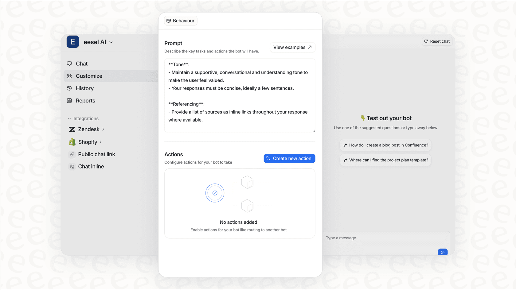
The pricing is straightforward too: you pay for interactions, not seats, and you can start with AI drafting replies before letting it handle conversations autonomously. For teams that want great support experiences without the development overhead, it's worth considering alongside traditional SDK theming.
Troubleshooting common theming issues
Even with clear documentation, things sometimes don't work as expected. Here are fixes for the most common problems:
Colors not applying: Ensure you're configuring colors before calling Zendesk.initialize(). The SDK reads theme settings at initialization time.
Dark mode looks wrong: Check that you've defined both userLightColors and userDarkColors. If you only set one, the SDK uses defaults for the other.
CSS changes not showing: On iOS, make sure your CSS file is included in the app bundle target. On Android, verify it's in the assets folder, not res.
Theme inheritance issues: If extending SDK themes, use the exact parent theme names: ZendeskSdkTheme.Light, ZendeskSdkTheme.Dark, or ZendeskSdkTheme.Light.DarkActionBar.
When to rebuild vs restart: Code changes (colors, themes) require a rebuild. CSS file changes often just need an app restart. If in doubt, rebuild.
Frequently Asked Questions
Share this article

Article by
Stevia Putri
Stevia Putri is a marketing generalist at eesel AI, where she helps turn powerful AI tools into stories that resonate. She’s driven by curiosity, clarity, and the human side of technology.