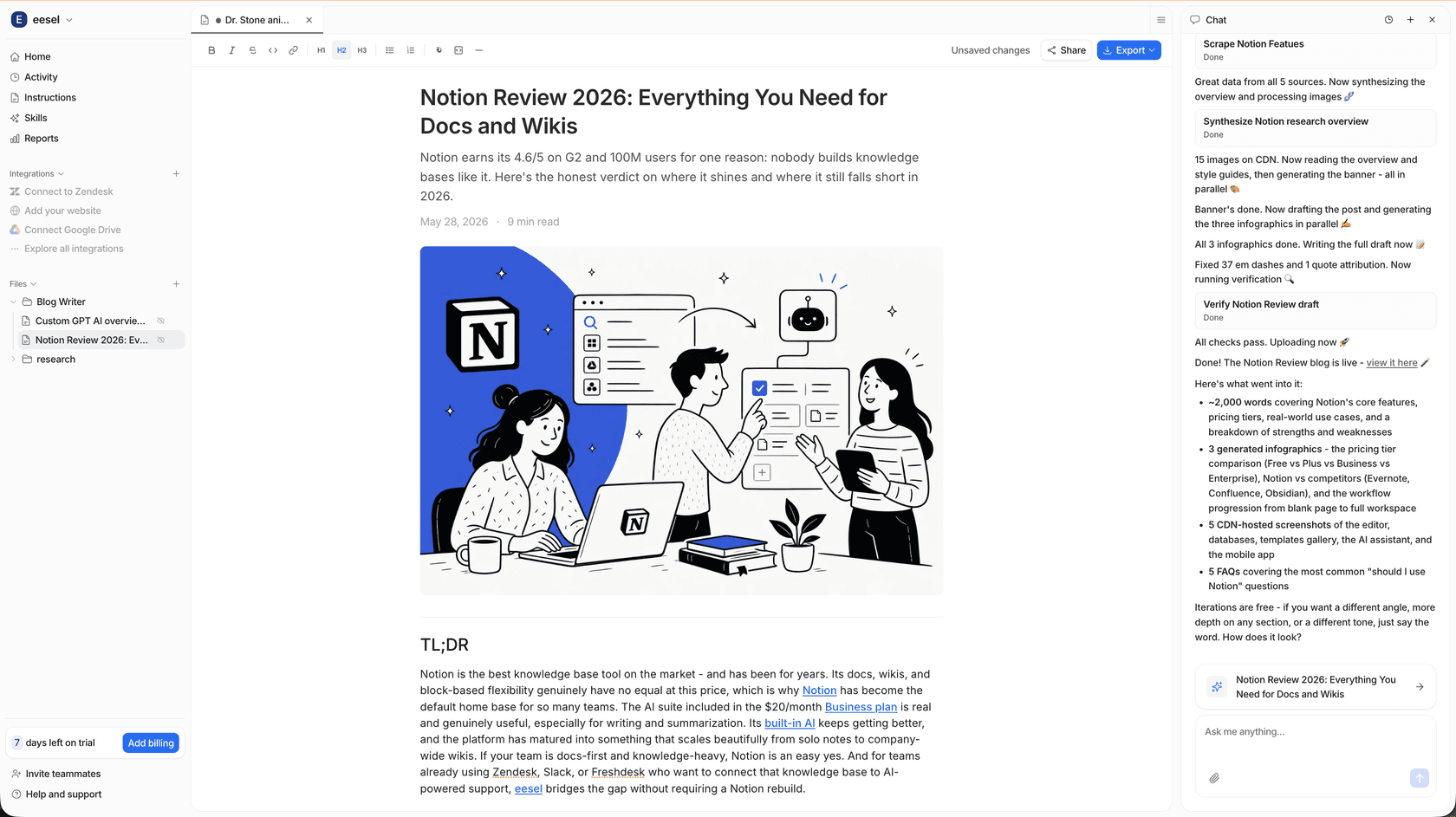
You’ve put in the hours. You researched a topic, outlined your points, and wrote a fantastic blog post. The traffic is coming in, and your analytics are looking up. But there’s a catch: people read, and then they just leave. No sign-ups, no comments, no next steps. What gives?
Often, the missing piece is the call to action (CTA). It’s a more common problem than you'd think. A wild 70% of small B2B businesses don't have a CTA on their homepage, let alone their blog posts. A CTA is the bridge that turns a passive reader into an active participant. It’s what guides them from just consuming your content to taking a real next step with your brand.
This guide will walk you through what blog CTAs are, why they matter so much, and a data-backed framework for writing them well.
Building a content engine that churns out high-quality articles with smart, context-aware CTAs is a massive growth lever. Modern tools like the eesel AI blog writer are built to weave these elements right into your workflow, helping you scale your content without losing that conversion punch.
What is a blog call to action (CTA)?
A call to action is simply a prompt in your blog post that encourages your reader to do something specific. It's more than just a button or a link; it's the natural conclusion to the value you've just provided. Without a CTA, your content just stops. It leaves the reader hanging, not sure what to do next.
Think of it this way: a blog post without a CTA is like giving a great presentation and then walking off stage without telling the audience where to learn more. You’ve got their attention, but you haven't given them a way to act on it. You’re leaving a lot of potential on the table.
The different types of blog CTAs
The right CTA depends on your post's topic and where your reader is in their journey. You wouldn't ask for marriage on a first date, right? The same logic applies here. Your CTA should match the reader's level of commitment.
Here are the main types you’ll be working with:
- For lead generation: These CTAs offer something valuable in exchange for an email address. They’re perfect for turning casual readers into leads you can connect with later. Examples include "Download the Free Checklist," "Get Your Template," or "Watch the Webinar."
- For audience engagement: The goal here is to build a community and start a conversation. These are low-commitment CTAs that make your blog feel more interactive. Think "Leave a comment below," "Share this article on Twitter," or "What are your thoughts?"
- For reader nurturing: These CTAs are designed to keep people on your site longer. They guide readers deeper into your content and help establish your authority. You might see "Read The Next Article: [Related Topic]," "Subscribe to Our Newsletter," or "Explore the Full Guide."
- For direct conversion: These are for readers who are closer to making a decision. They guide people toward a sale or a sales-related conversation. Examples are "Start Your Free Trial," "Book a Demo," or "Shop the Collection."
Why are blog CTAs important?
Putting a little extra thought into your CTAs isn't just a nice-to-have. It has real benefits that directly affect your business goals. Here’s why a solid CTA is a must.
Guide the user journey
A clear CTA takes the guesswork out of the equation. It tells your reader exactly what to do next, creating a smooth path for them to follow. The impact of clear direction is significant; one study found that a single, focused CTA in an email can increase sales by 1,617%. While a blog CTA might not hit that number every time, it shows how much people appreciate being told what to do.
Drive business goals
Your blog isn’t just a library; it’s a business asset. CTAs are what turn traffic into results like leads, subscribers, and customers. Every post without a relevant CTA is a missed opportunity.
Include a CTA to access gated content related to the topic of the particular post, at the beginning and end of each post.
Boost reader engagement
By asking for comments or shares, you turn your blog from a monologue into a conversation. This helps build a loyal community around your brand. Even simple nurturing CTAs, like a "Read More" link, can lead to a 121% higher click-through rate.
Enhance your SEO
CTAs that encourage readers to click on other articles on your site are great for SEO. They help search engines understand your site's structure and how your content is related. More importantly, they increase "dwell time" (how long a visitor stays on your site), which signals to search engines that your content is valuable.
A simple framework for how to write blog CTAs
Crafting a great CTA doesn't have to be a guessing game. Here’s a simple, step-by-step framework you can use every time to create CTAs that actually get clicks.
Step 1: Define your goal
Before you even think about wording, you need to know what you want the blog post to achieve. Every post should have one main goal. Ask yourself: "What is the single most important action I want a reader to take after finishing this?"
Your CTA has to match the reader's intent. If your post is a high-level educational article, a big ask like "Book a Demo" will probably fail. Instead, offer something that fits their informational needs, like "Download the Ultimate Guide." On the other hand, a post comparing your product to a competitor is the perfect spot for a more direct "Start Your Free Trial" CTA.
Step 2: Use strong, action-oriented language
The best CTAs start with a strong command verb. Think: Get, Start, Join, Discover, Download, Find. These words are direct and get people moving.
Steer clear of vague phrases like "Click Here" or "Read More." They don't tell the reader why they should click. Instead, focus on the value they'll get. "Click Here" becomes "Get Your Free Template."
You can also use first-person phrasing. Simple tests have shown that changing a CTA from "Start Your Free Trial" to "Start My Free Trial" can boost click-through rates. It creates a sense of ownership and makes the action feel more personal.
Step 3: Create urgency and convey value
People are natural procrastinators. A little nudge can go a long way. Giving readers a reason to act now can have a huge impact. In fact, adding simple urgency cues has been shown to increase conversions by 332%. You can do this with phrases like:
- "Limited Spots Available"
- "Offer Ends Friday"
- "Get It Before It's Gone"
Along with urgency, your CTA must clearly answer the reader's silent question: "What's in it for me?" The copy should highlight the benefit they'll receive, not just the action they need to take. Instead of "Download the PDF," try "Download the PDF to Save 10 Hours This Week."
Step 4: Keep it clear, concise, and specific
Your CTA needs to be understood in a flash. Keep the text short and sweet, ideally between two to five words. Anything longer risks losing the reader's attention.
Be aware of "friction words", words that imply effort, like Submit, Buy, Order, or Download. While sometimes you can't avoid them, they can cause hesitation. If you can, try using lower-commitment phrases like "Get Access" or "See How It Works" to make the click feel less intimidating.
CTA design and placement best practices
Great copy is only half the battle. If your CTA is buried or blends into the background, no one will click it. Here's how to make sure your CTAs get seen.
Make it visually distinct
- Use buttons, not just links. People are trained to click buttons. Data shows that a button-based CTA can increase click-through rates compared to a simple text link. They just pop more.
I believe it will be 1-2 line of text + button
- Pick a contrasting color. There's no single "best" color. The most important thing is that your CTA button stands out from the rest of the page. In one famous A/B test, a red button outperformed a green one by 21%, not because red is a magic color, but because it created a stark visual contrast with the site's green color scheme.
- Give it some space. An uncluttered design converts better. Surrounding your CTA with plenty of whitespace makes it easier to spot and less intimidating to click. This simple trick alone can improve conversions by 232%.
Choose your placement strategically
Where you put your CTA matters. Here are a few key spots to think about:
- End-of-post: This is the most common and logical place. The reader has finished your content, gotten value, and is now ready for what's next.
- In-content (Inline): Don't be afraid to place text-based or button CTAs right in the body of your article where they feel relevant. For example, if you mention a specific tool, you can link to a detailed guide about it right then and there.
Inline CTAs had the highest conversion rate. Readers were already engaged and more likely to click.
- Centered alignment: Our eyes naturally flow down the center of the page. It’s no surprise that center-aligned CTAs can get up to 682% more clicks than those pushed to the side.
- Above the fold: For your most important pages, a CTA placed "above the fold" (visible without scrolling) has a 73% visibility rate. This makes it prime real estate for your most critical call to action.
Always design for mobile-first
More people read blogs on their phones than on desktops. If your CTAs aren't mobile-friendly, you're losing out. Just optimizing your CTAs for mobile can improve conversion rates.
This means your CTAs must be large, easily tappable buttons. Trying to hit a tiny text link with your thumb is just frustrating. Apple's design guidelines suggest a minimum touch target size of 44x44 pixels to ensure a good user experience.
For a more detailed breakdown of writing high-converting CTAs, including plenty of real-world examples, check out the video below. It provides a great visual guide to complement the framework we've discussed.
Scaling your CTA strategy with the eesel AI blog writer
Manually crafting a unique, optimized, and relevant CTA for every single blog post can be a significant bottleneck. It takes time, and it’s often the first thing that gets skipped when you're trying to publish consistently. This leads to generic, weak CTAs like "Contact Us" being slapped at the end of every post, which kills your conversion potential.
This is where the eesel AI blog writer can help. It solves this problem by building CTA creation directly into the content generation process, ensuring every post goes out with a powerful, tailored call to action.
Here's how it helps:
- It understands context: When you provide your website and a blog topic, the eesel AI blog writer analyzes the context to generate CTAs that align with the reader's intent. Instead of a generic "Learn More," it creates a prompt that feels like the logical next step.
- It enables natural product integration: It smoothly weaves your product or service into the blog post's narrative. This makes the final call to action feel like a helpful suggestion rather than a jarring sales pitch.
- It delivers speed and scale: It allows you to produce a high volume of quality articles, each complete with a relevant, conversion-focused CTA. This is the exact tool we used at eesel to grow our daily impressions from just 700 to over 750,000 in three months.
Start turning readers into action-takers
A strong call to action isn't an afterthought; it's a strategic tool that gives your content purpose. To work, it must be clear, valuable, action-oriented, and well-designed. By following the framework in this guide, you can move from creating content that just informs to creating content that drives real action.
Here's a challenge for you: go look at the CTAs on your five most popular blog posts. Are they clear? Do they offer value? Are they visually distinct? Find one or two things you could improve based on what you’ve learned here and see what happens.
And if you're ready to scale your content production and ensure every post has a conversion-focused CTA built-in from the start, try the eesel AI blog writer for free. Generate your first publish-ready article in minutes and see the difference for yourself.