Blog
Tips, guides, and insights on AI teammates, smarter support, and building better teams.


What is Gemma 4? Google's open AI model family, explained
What is Gemma 4? A plain-English guide to Google's open-weight model family: the five sizes, the Apache 2.0 license, the benchmarks, and what it means for support teams.
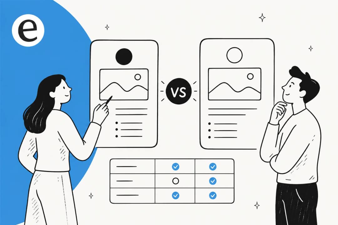
AI comparison page writer: how to write "vs" pages that rank and convert
An AI comparison page writer can draft a "vs" or alternatives page in minutes. Here's how to use one to build pages that convert, instead of spam Google ignores.

How do I localize my blog content with AI?
How do I localize my blog content with AI? Here's the 5-step workflow I use to take posts global, plus the one mistake that gets localized content ignored by Google.

AI blog localization: how to take your content global without wrecking your SEO
AI blog localization can open new markets fast, or fill your site with robotic translations Google ignores. Here is how to do it at scale and keep your rankings.

AI pillar page generator: how to build pillar pages that actually rank
An AI pillar page generator can draft a hub-and-spoke topic cluster in an afternoon. Here's how to use one for real topical authority instead of a spam farm.

AI glossary generator: how to build glossary pages that actually rank
An AI glossary generator can spin up hundreds of definition pages in an afternoon. Here's how to use one for real SEO traffic instead of getting your site filed under scaled content abuse.

AI press release writer: how to write a B2B or SaaS announcement that lands (2026)
An AI press release writer nails the wire format in seconds, but the news angle and the quote are still on you. Here's how to write a B2B or SaaS announcement with AI that doesn't read like a robot wrote it.
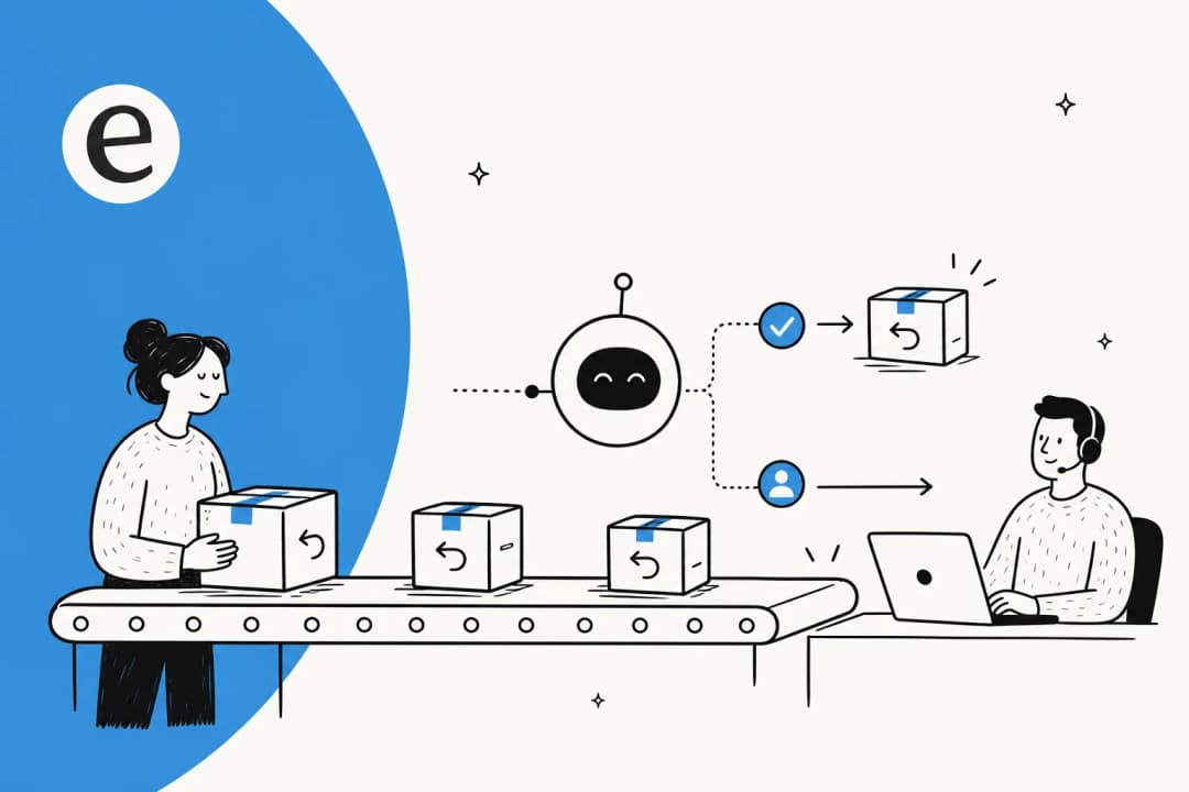
Can AI handle refunds and returns? Yes, but only the part you'd want it to
Can AI handle refunds and returns? It can run the routine majority end to end, but the smart move is letting it auto-handle the clear cases and routing judgment calls to a human.

How do I support customers in multiple languages with AI?
You don't need a polyglot team to support customers in multiple languages with AI. Here's how one agent covers 80+ languages, and how to roll it out without breaking trust.
Ready to hire your AI teammate?
Set up in minutes. No credit card required.