Groove reporting: a complete guide to analytics and insights in 2026
Amogh Sarda
Last edited April 2, 2026
When you're running a support team, data is everything. You need to know how many tickets are coming in, how fast your team is responding, and whether customers are actually happy with the help they receive. That's where Groove reporting comes in.
But here's the thing: there's some confusion about which "Groove" we're talking about. GrooveHQ is a help desk platform for customer support teams. Groove by Clari is a completely different product, a sales engagement platform. This guide focuses on GrooveHQ's reporting features for support teams.
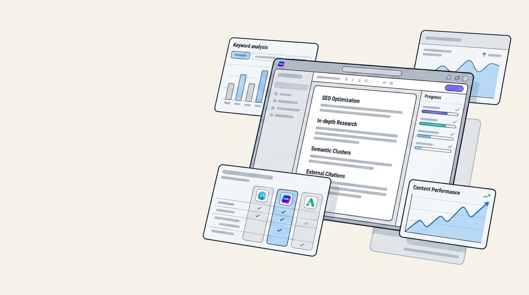
If you're evaluating reporting solutions, it's worth knowing what's out there. Tools like eesel AI take a different approach, using AI to not just track metrics but actually improve them. Let's break down what Groove reporting offers and how it compares.
What is GrooveHQ?
GrooveHQ is a help desk software platform built specifically for small and mid-size businesses. It brings together customer emails, live chat, and social media messages into a single shared inbox where teams can collaborate.
The platform includes ticketing, a knowledge base for self-service, live chat for real-time support, and automation rules to handle repetitive tasks. It's positioned as a simpler alternative to enterprise tools like Zendesk or Freshdesk, focusing on ease of use rather than overwhelming feature sets.
GrooveHQ is trusted by over 130,000 customer support experts and companies like Data Dog, Stussy, and App Sumo. It rates 4.6 stars on G2 with 193+ reviews, suggesting users generally find it delivers on its promise of straightforward support management.
Groove reporting dashboard explained
Accessing your reports in GrooveHQ is straightforward. Click "Reports" in the top navigation and you'll see four main categories: Conversations, Productivity, Happiness, and Knowledge Base.
Reports can be viewed organization-wide or filtered by specific inboxes. This flexibility lets managers see the big picture or drill down into specific channels, support tiers, or product lines.
Each report section has a date range selector and tooltips explaining what metrics mean. Hover over the question mark icons to see exactly how each data point is calculated, which helps avoid misinterpretation.
Understanding Groove's five report types
GrooveHQ breaks reporting into five distinct categories, each serving a different purpose for support managers.
Conversation reports
The Conversation Report shows your support volume and the types of conversations you're handling. You'll see incoming and outgoing message counts, which helps identify trends in customer demand.
The "Busiest Times" heatmap is particularly useful for staffing decisions. It shows when ticket volume peaks throughout the day using color coding: teal for slower periods, magenta for busy times. This data helps you schedule team meetings during quieter hours and ensure coverage during crunch times.
The Tag Insights section shows how often each tag was used in the selected period. This helps identify emerging issues. If you suddenly see a spike in "billing-error" tags, you know something needs attention upstream.
Finally, the Team Leaderboard ranks agents by various metrics. Use this carefully. It's great for recognizing top performers, but focusing too heavily on speed metrics can incentivize rushing through tickets rather than solving problems properly.
Productivity reports
Productivity Reports focus on efficiency metrics: response times, resolution times, and overall throughput. You'll see first response time, average resolution time, and tickets solved per agent.
These metrics tell you whether your team is keeping up with demand. If first response times are creeping up while ticket volume stays flat, you might have a staffing or workflow issue.
The key is interpreting these numbers in context. Fast response times don't matter if customers need to write back multiple times to get their issue resolved. Look at productivity metrics alongside happiness scores to get the full picture.
Happiness reports
Happiness Reports track Customer Satisfaction (CSAT) ratings. To use this feature, you need to activate the CSAT tool in Groove settings. Once enabled, customers receive satisfaction surveys after their tickets are resolved.
You'll see overall satisfaction percentages, rating distributions, and trends over time. The report also links to recently rated conversations, letting you review specific interactions that received high or low ratings.
This is arguably the most important report. Response times and ticket counts are operational metrics. CSAT tells you whether you're actually delivering value to customers. A team can have excellent productivity numbers but poor satisfaction if they're solving the wrong problems or providing incomplete answers.
Teammate reports
Teammate Reports show individual agent performance. The overview page displays workload distribution across your team, helping identify if someone is overwhelmed while others have capacity.
Click into any agent to see their detailed stats: tickets handled, average response time, resolution rate, and recent rated conversations. This is useful for one-on-ones and coaching sessions.
The report helps managers spot training needs. If one agent consistently has longer resolution times than peers for similar ticket types, they might need additional training on that product area or workflow.
Knowledge base reports
If you're using Groove's knowledge base, you'll get analytics on self-service effectiveness. Metrics include total visits, unique visitors, articles viewed, average time on page, search usage rates, and failed searches.
The most valuable section here is the list of failed searches. These are queries where customers searched your knowledge base but didn't click on any results. This directly tells you what content you're missing.
You'll also see your most popular articles and top searches. Use this data to prioritize documentation updates. If 30% of searches are for "password reset" but your article on that topic is buried on page three of results, you have an easy win available.
Groove pricing and reporting access
Reporting features vary by plan. Here's what's included at each tier:
| Plan | Price | Reporting Features | Other Key Features |
|---|---|---|---|
| Standard | $29/user/month (annual) | Standard reporting | 2 shared inboxes, 1 knowledge base, 40+ integrations |
| Plus | $45/user/month (annual) | Advanced reporting + AI features | 5 shared inboxes, SLA management, AI summarize, sentiment analysis |
| Pro | $70/user/month (annual) | Data exports + all reporting | 25 shared inboxes, enterprise security, dedicated account manager |
Source: Groove Pricing
The Standard plan includes basic reporting across all five report types. You can view metrics and export basic data.
Plus adds "advanced reporting" and introduces AI features: conversation summarization, automatic sentiment detection, and AI-powered tagging. These features can save time on manual analysis.
Pro adds data exports, which is essential if you need to pull raw data into external BI tools or create custom reports. It also includes quarterly account optimization reviews where Groove's team helps you analyze your reporting data.
All plans include a 30-day free trial. If you're evaluating Groove specifically for reporting capabilities, use that trial period to test whether the metrics provided actually answer your business questions.
Groove reporting limitations and user feedback
Real user feedback on Groove's reporting is mixed. On Capterra, Groove holds a 4.5/5 rating from 87 reviews, with users praising simplicity but noting limitations.
One IT Coordinator reviewed Groove as "a little on the expensive side" and noted that "in the world of AI, we found we didn't need all of the extra features that came with a bigger price tag." This reflects a common tension: Groove's per-seat pricing adds up quickly for growing teams.
A CEO in health and wellness noted the lack of live phone support makes it "hard for us to deal with immediate issues we may have." This is worth considering if you need real-time support for your support tool.
On SoftwareReviews, Groove by Clari (the sales product, not the help desk) received feedback that "the reporting is useful, but it could be more flexible and detailed for deeper analysis." Several users mentioned difficulty tying activity metrics directly to revenue outcomes.
The core limitation is that Groove's reporting tells you what happened, but not necessarily why. It tracks operational metrics well, but connecting those metrics to business outcomes (churn, expansion revenue, customer lifetime value) requires manual analysis or external tools.
eesel AI: a modern approach to support analytics
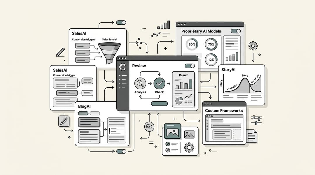
At eesel AI, we take a different approach to support analytics. Instead of just tracking what happened, our AI identifies patterns and surfaces actionable insights automatically.

Here's how we differ:
Automatic topic detection: Our AI analyzes every conversation to identify what customers are actually asking about, not just what agents tag. This often reveals issues teams didn't know were trending.
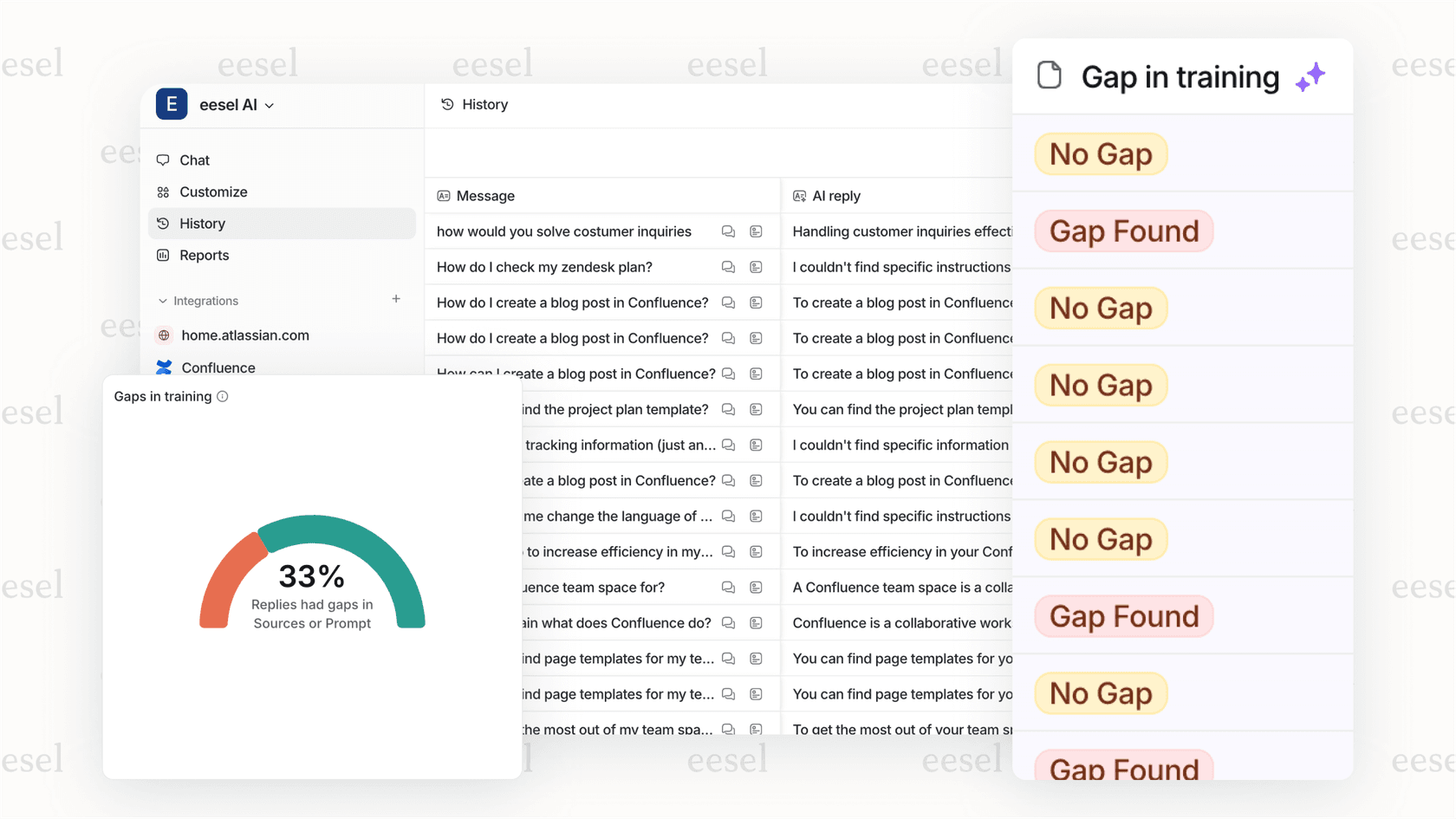
Knowledge gap identification: We automatically spot where your help center is missing articles based on questions the AI couldn't answer confidently. No more guessing what content to create next.
Plain-English insights: Rather than presenting raw metrics, we explain what they mean. "Your password reset requests are up 40% this week. Consider adding a self-service option to your login page."
Per-interaction pricing: Unlike per-seat models where you pay for every agent regardless of ticket volume, we charge based on AI interactions. This often works out cheaper for teams with seasonal volume fluctuations.
Progressive rollout: Start with our AI Copilot drafting responses for review. Once you're confident in quality, graduate to full AI Agent autonomy. You're not forced to choose between full automation and manual work.
Our reporting doesn't just track performance. It actively improves it by identifying automation opportunities, knowledge gaps, and training needs.
Choosing the right reporting solution for your support team
The right reporting tool depends on your team size, complexity, and growth stage.
GrooveHQ works well for:
- Small to mid-size teams (5-50 agents)
- Teams transitioning from shared inboxes to structured support
- Organizations that need straightforward metrics without complexity
- Teams prioritizing simplicity over deep analytics
Consider alternatives like eesel AI if:
- You want AI to identify insights automatically, not just track metrics
- Per-seat pricing doesn't fit your volume model
- You need help connecting support metrics to business outcomes
- You want to progress from assisted responses to full AI automation
The best approach is to start with clear questions: What decisions will this data inform? What actions will you take based on these reports? If you can't answer those questions, even the most comprehensive reporting won't provide value.
Try tools during their trial periods with real data. Generate the reports you'd actually use week-to-week. The interface that makes sense in a demo might feel different when you're digging into your own team's performance.

Frequently Asked Questions
Share this article

Article by
Amogh Sarda
CEO of eesel AI. Amogh Sarda is obsessed with making the ultimate AI for customer service teams. He lives in Sydney, Australia and has previously worked at Atlassian and Intercom. Outside of work he’s usually surfing or on stage doing improv.