Blog
Tips, guides, and insights on AI teammates, smarter support, and building better teams.


HubSpot Service Hub knowledge base AI: how it works, setup, and what it costs
A practical look at HubSpot Service Hub knowledge base AI: the Customer Agent, the Knowledge Base Agent, how to set both up, and what deflection really costs.
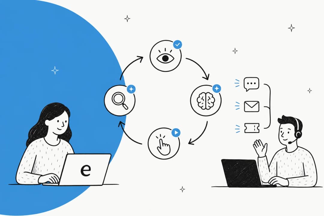
What is an AI agent loop? A plain-English guide
An AI agent loop is the perceive, reason, act, observe cycle that turns an LLM into an agent. Here is how it works, and why it matters for support.
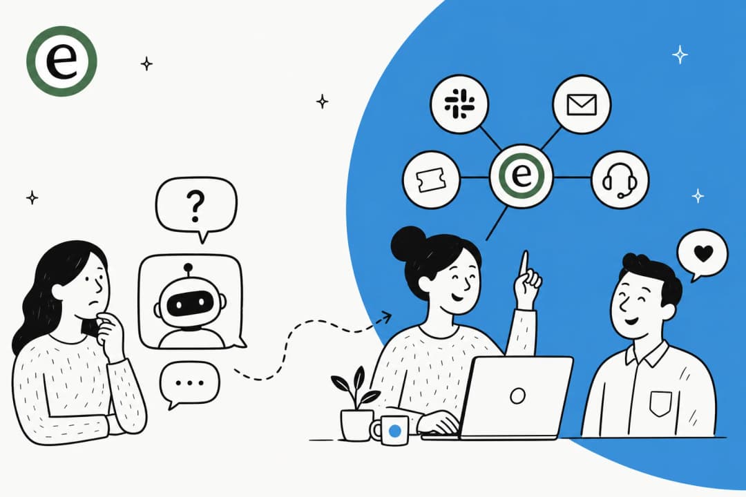
AI agents vs AI chatbots: the real difference and when to use each
AI agents vs AI chatbots: chatbots answer questions, agents take actions and close tickets. Here is the real difference and when to reach for each.

What is vibe coding? A plain-English guide for 2026
Vibe coding means describing what you want to an AI and letting it write the code. Here's what it is, where it came from, the risks, and when to actually use it.
Vibe coding for non-developers: what it actually is and how to use it safely
A plain-English guide to vibe coding for non-developers: what it means, the tools to use, where it breaks, and what's safe to build yourself.
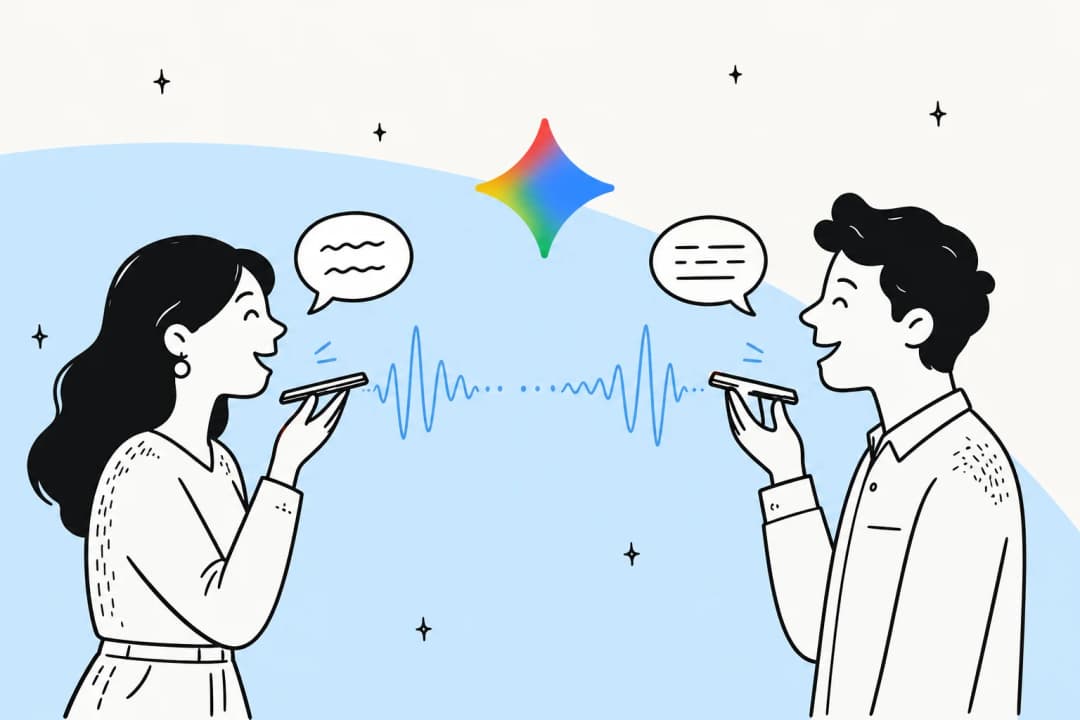
What is Gemini 3.5 Live Translate?
Gemini 3.5 Live Translate is Google's real-time speech-to-speech translation model for 70+ languages. Here's what it does, how it works, and where it fits.
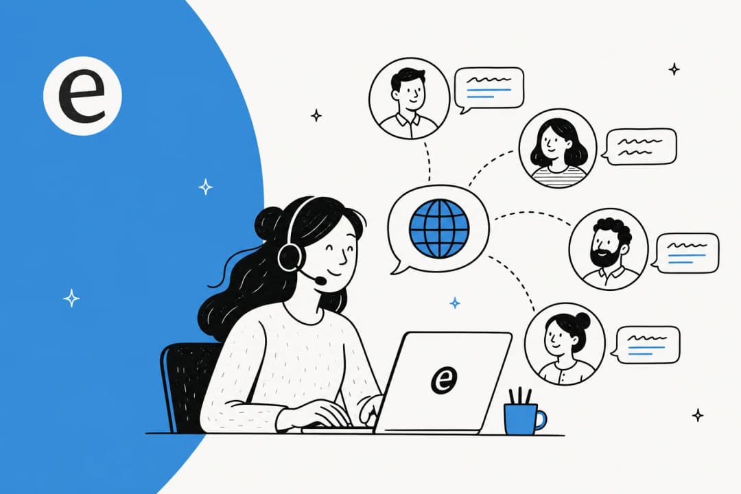
AI real-time translation for business: how it actually works in 2026
AI real-time translation for business explained: where companies use it, how it handles support in any language, and what to check before you trust it.
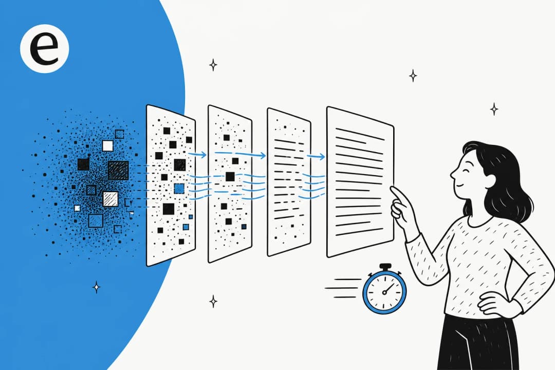
What is DiffusionGemma? Google's open-weights diffusion LLM, explained
DiffusionGemma is Google's open-weights text-diffusion model: a 26B Mixture-of-Experts that writes whole blocks of text in parallel for up to 4x faster generation.
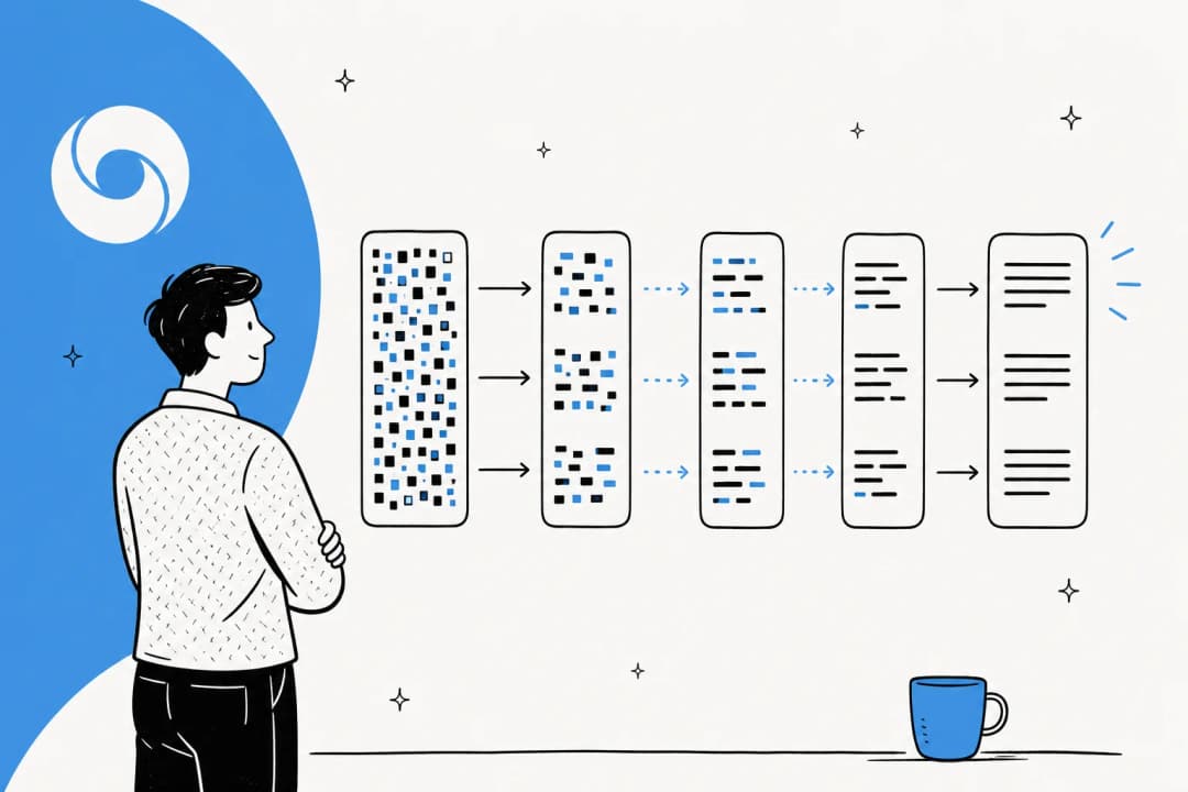
Diffusion-based AI models explained: how they work and why they're suddenly fast
A plain-English guide to diffusion-based AI models: how they differ from autoregressive LLMs, why they generate text 10x faster, and what that means for businesses.
Ready to hire your AI teammate?
Set up in minutes. No credit card required.